Hello, Apprentice. You are here because you have finished my blog writing of Sci-Fi modelling for Beginners. Or if you have not, please go read it because you need to know the techniques and tricks I’m using here.
So I’m going to build interiors of Port Olisar from Star Citizen. I’ll show you how i do it and how i got through it and hopefully you learn or get inspired enough to start your own journey.
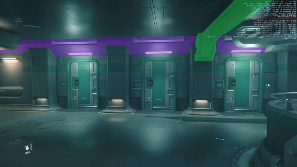
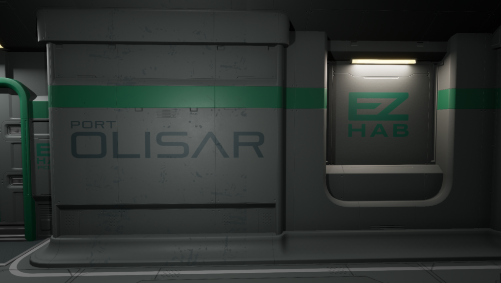
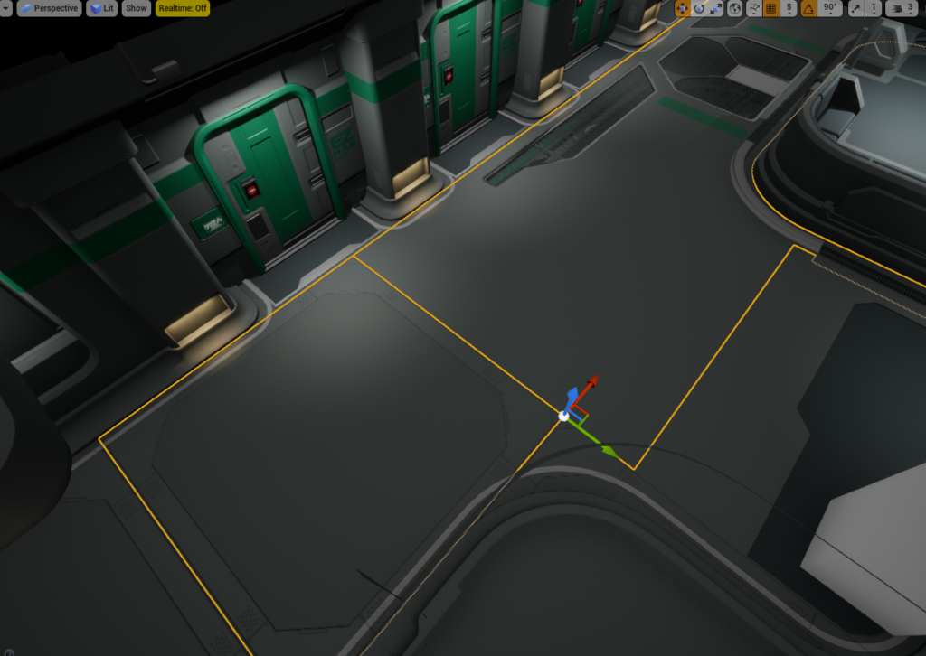
First Look
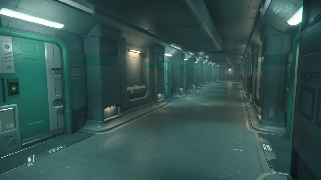
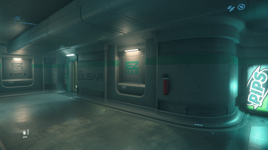
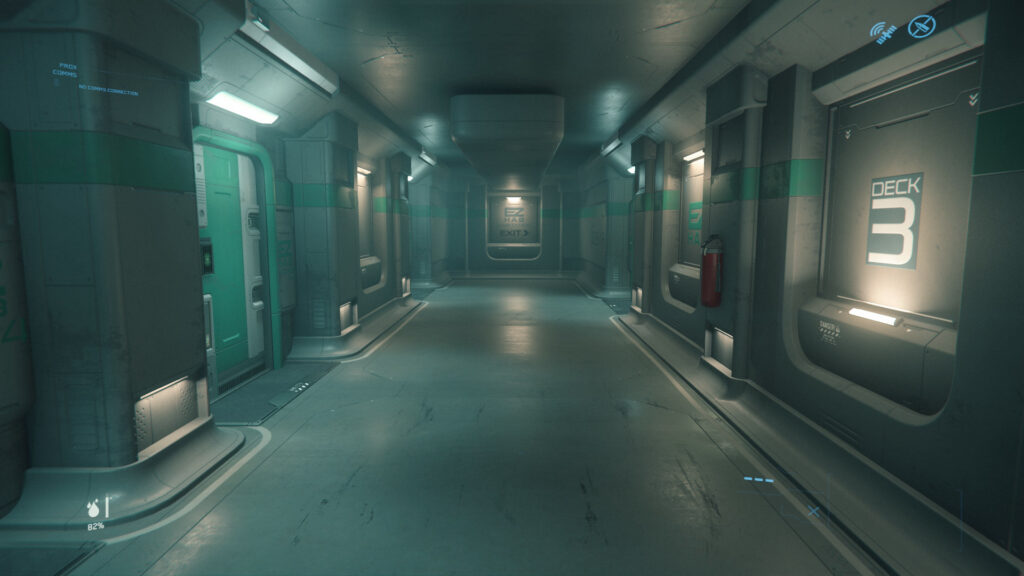
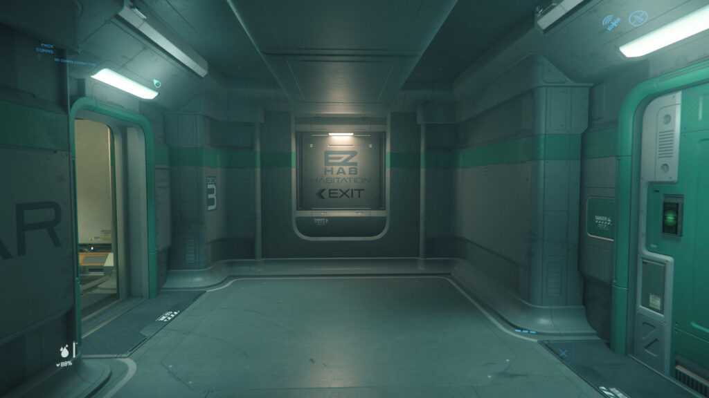
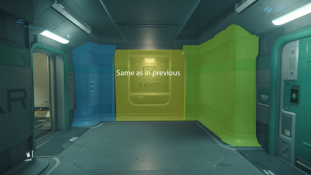
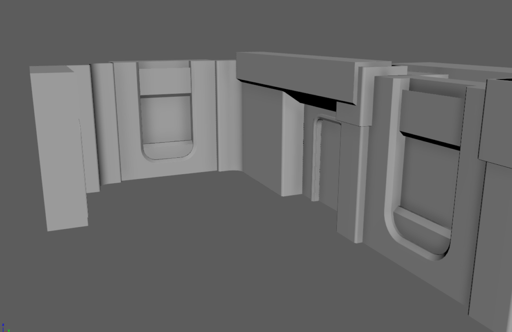
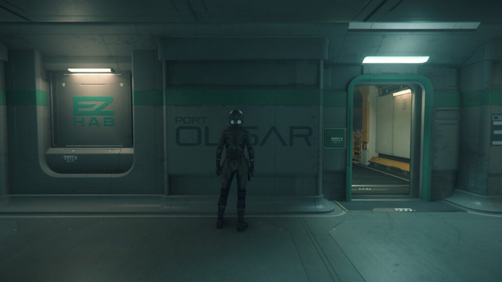
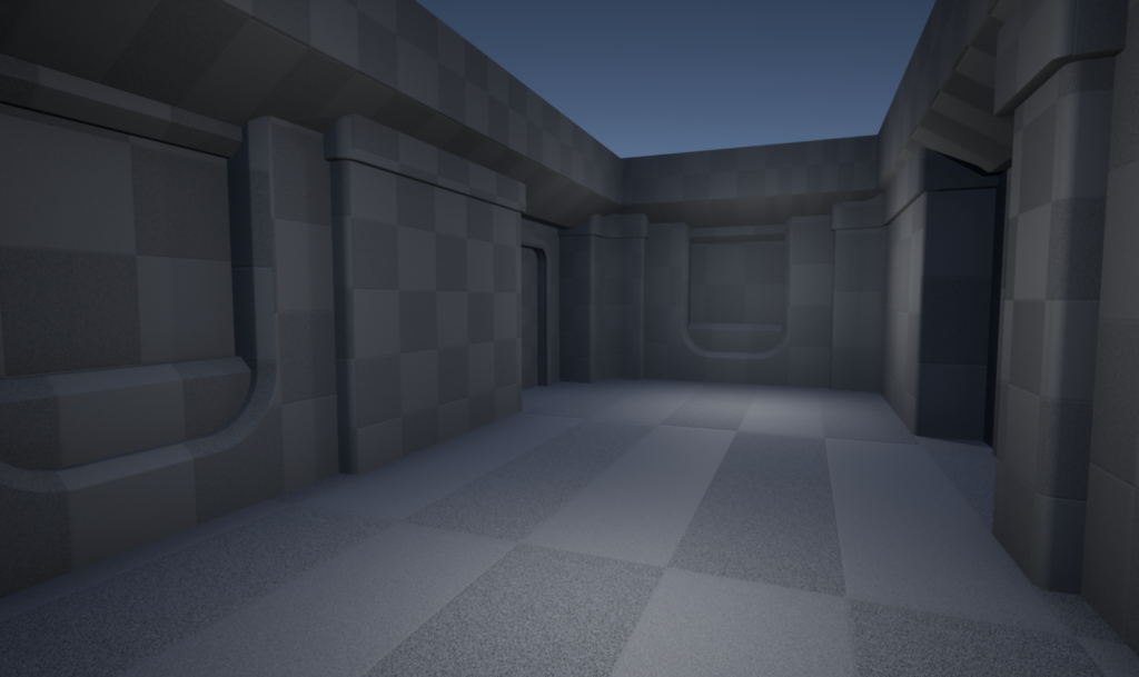
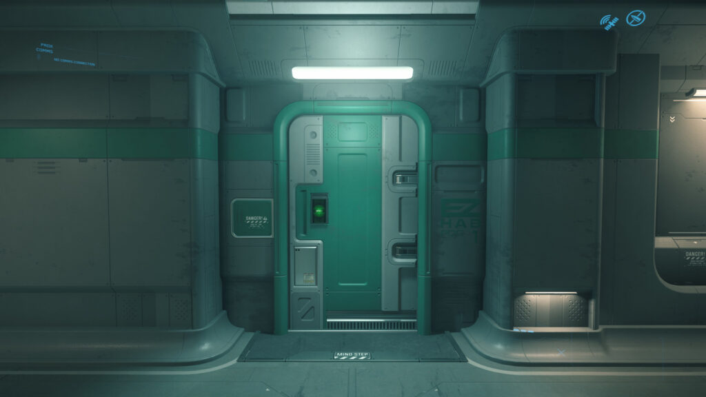
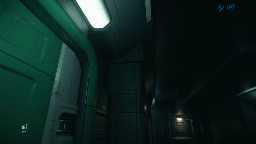
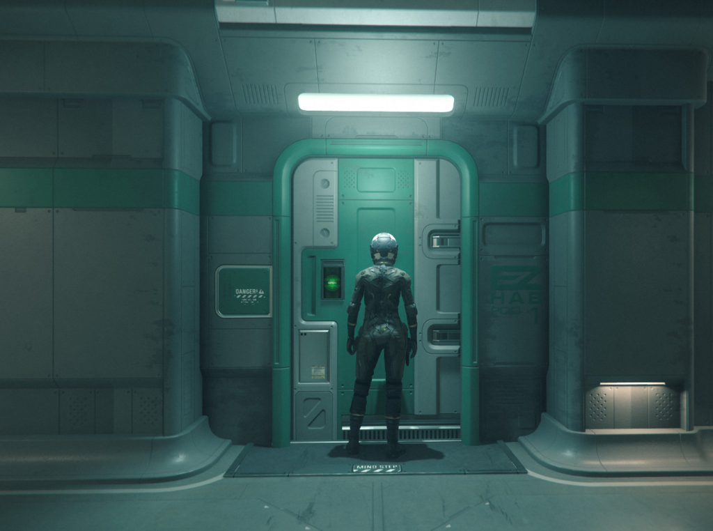
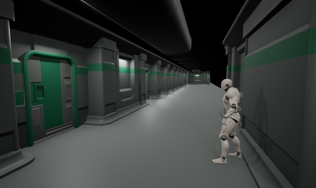
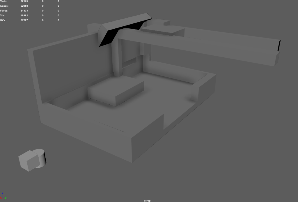
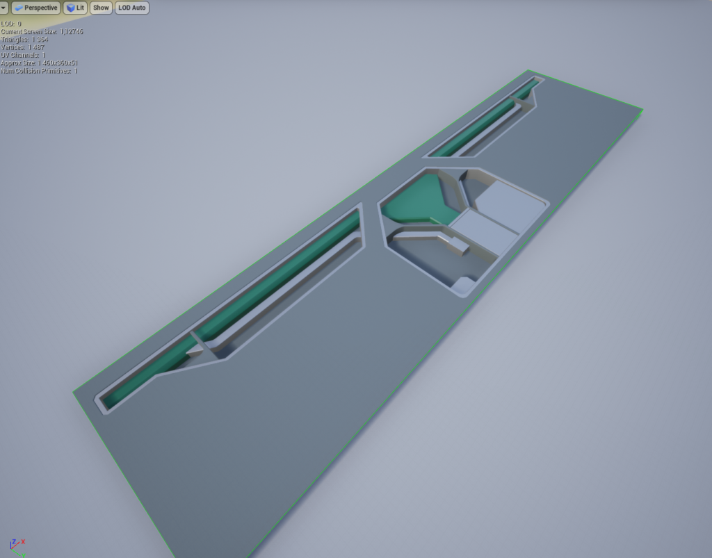
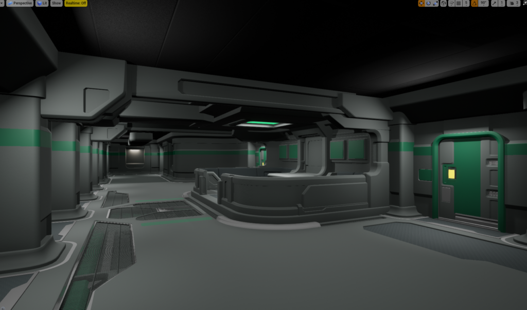
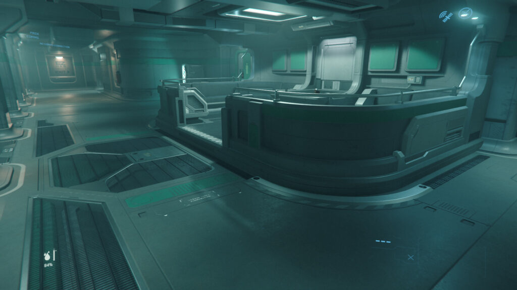
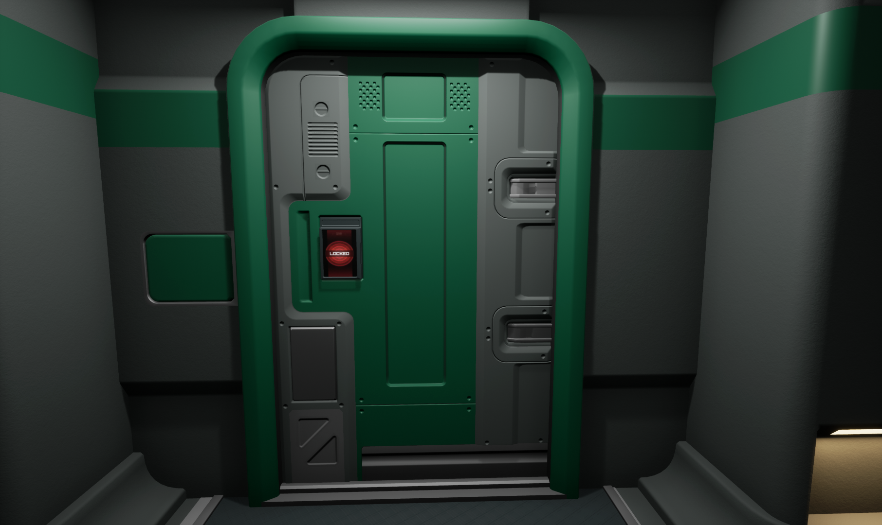
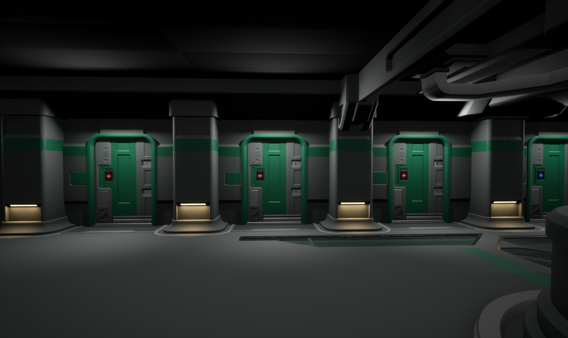
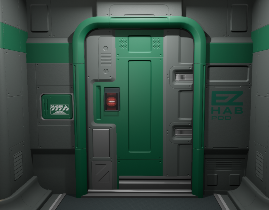
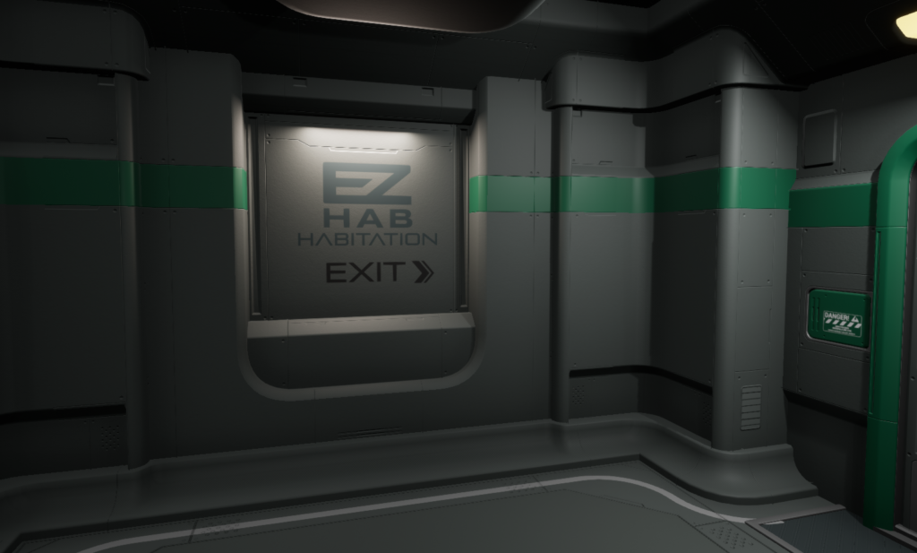
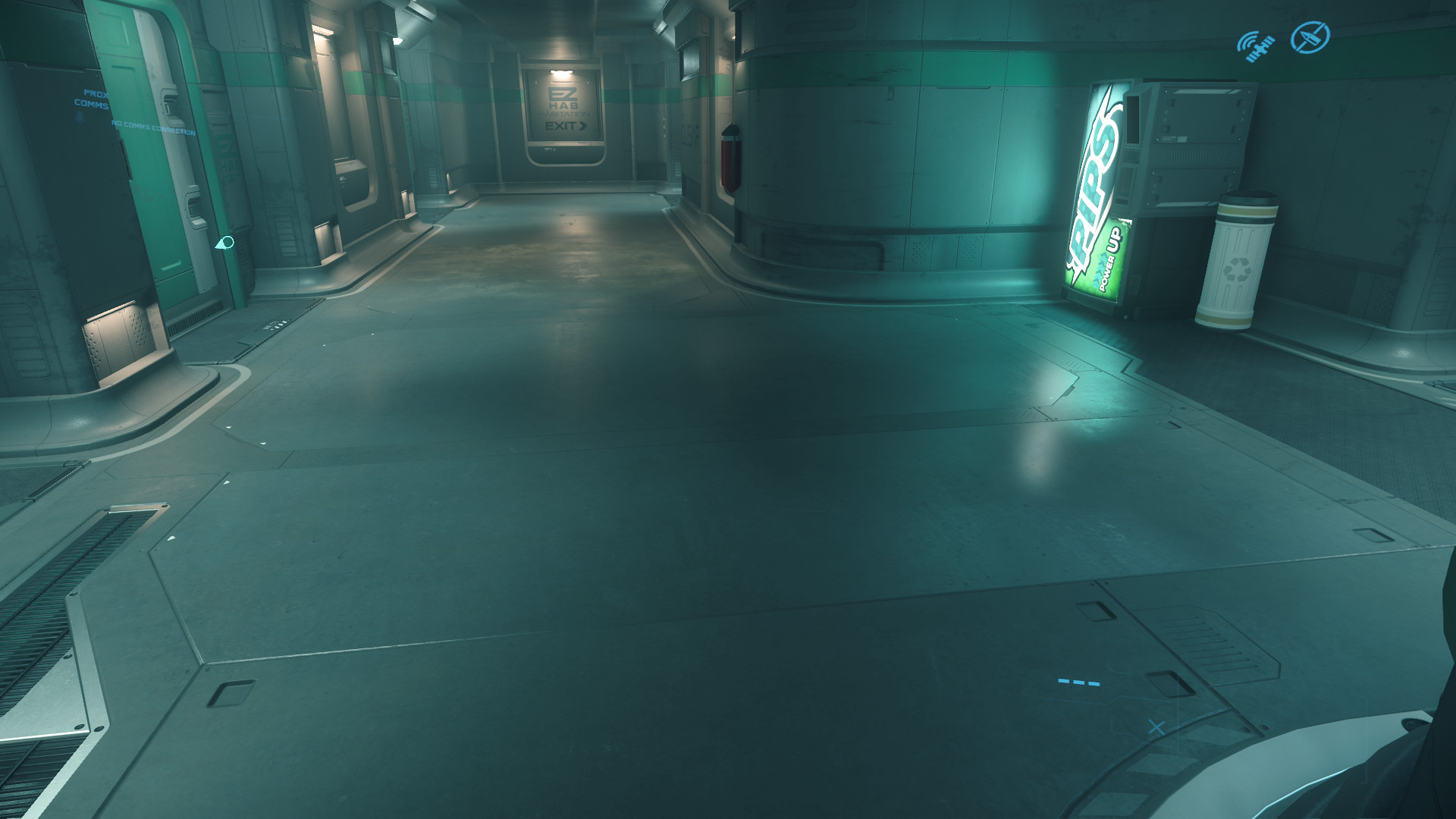
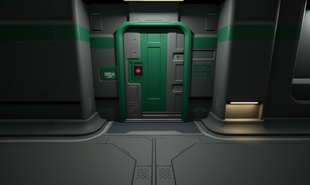
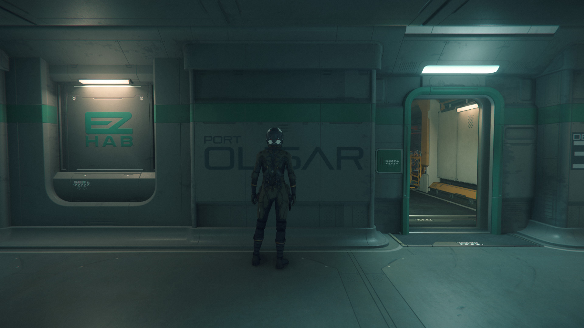
This is how EZ Hab looks like in Port Olisar.
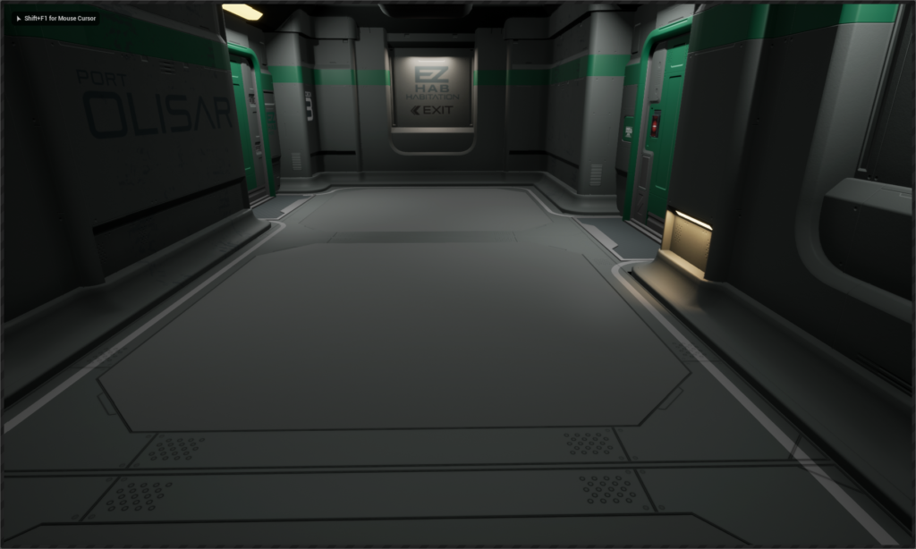
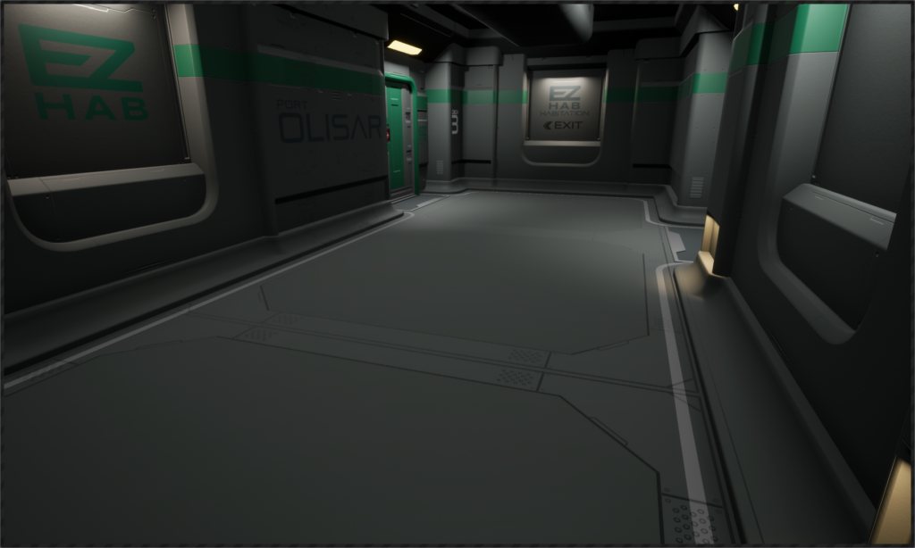
There are two hallways, they are made from modular pieces.
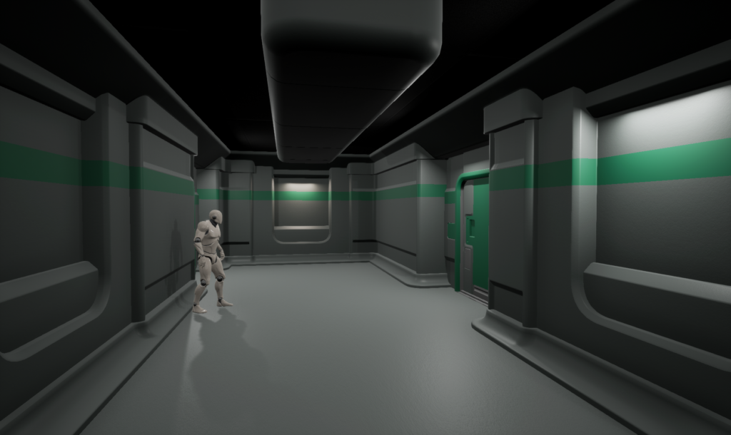
Straight Hallway.
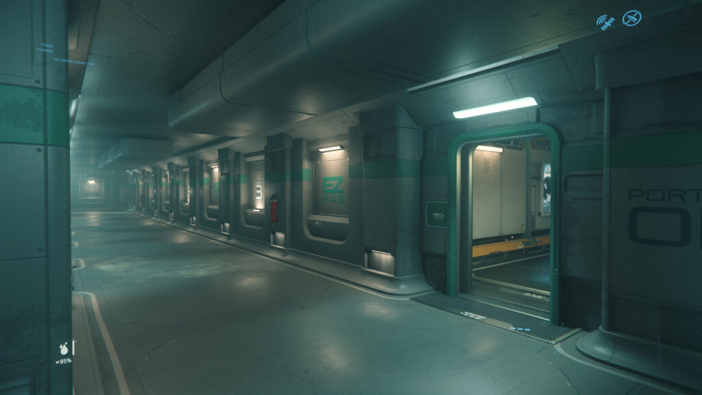
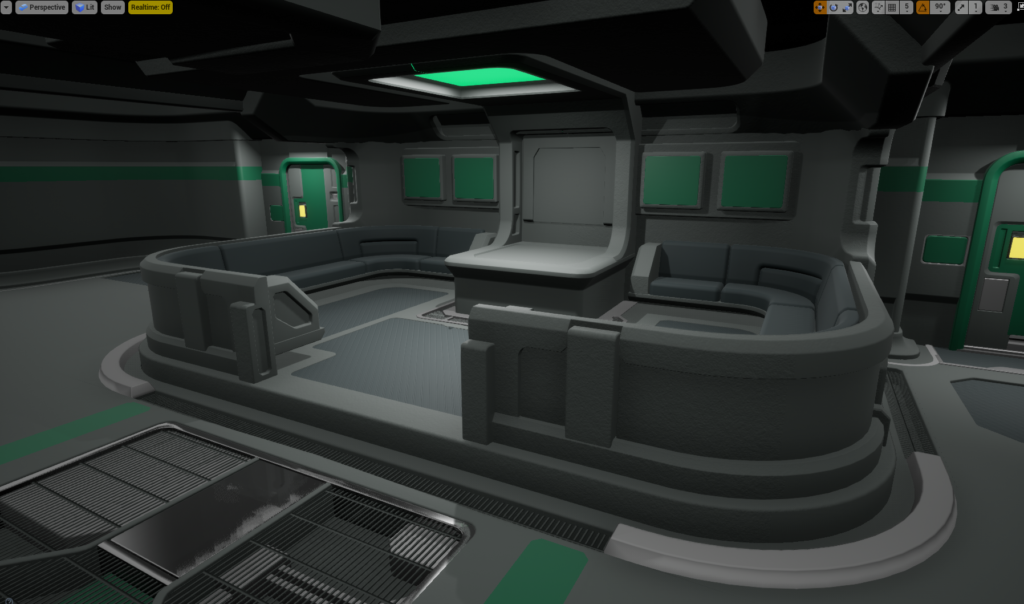
The other side has depth cutout, toilets, vending machines and raised seats.

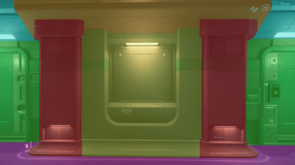
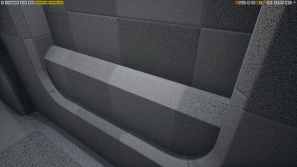
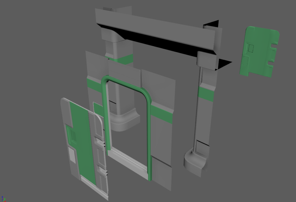
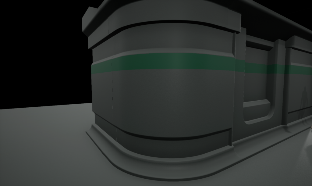
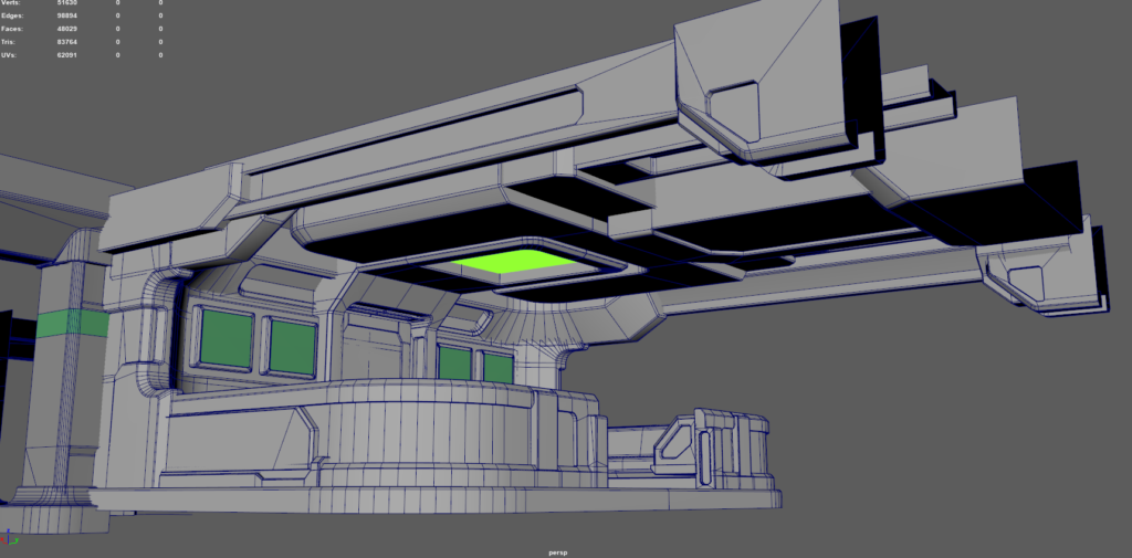
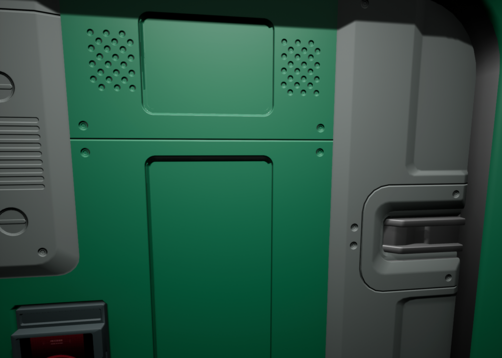
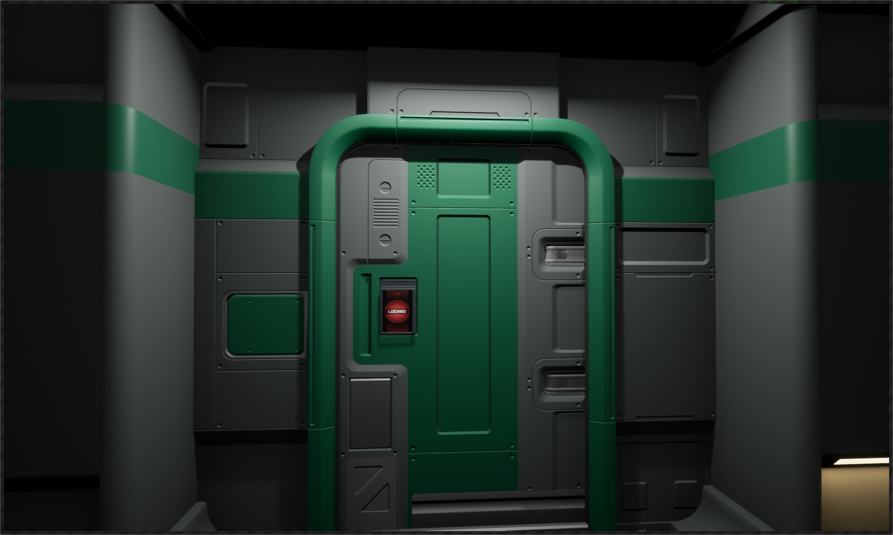
Let’s look at this piece:
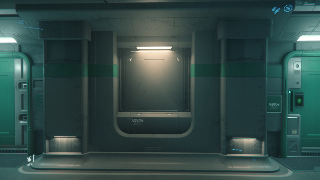
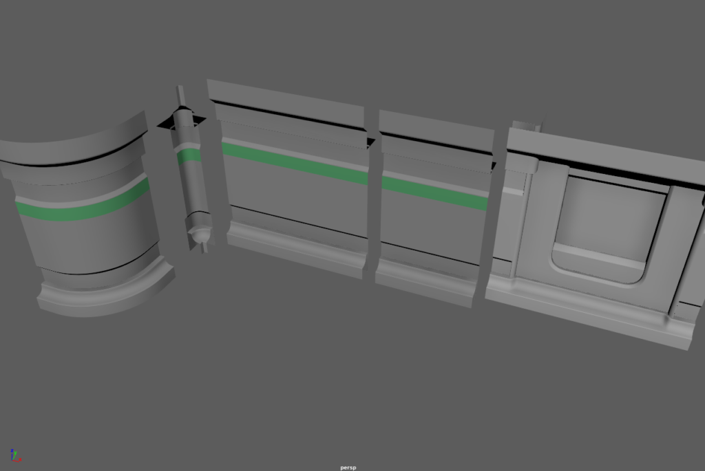
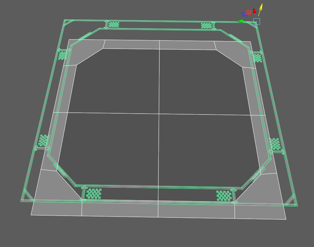
It’s made from modular pieces and if we reveal those pieces it looks like this:
These are just primary shapes i revealed, there’s some smaller pieces too but we consider those as secondary shapes and therefore we can ignore them because for now we want to focus on primary shapes.
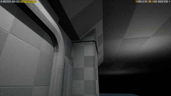
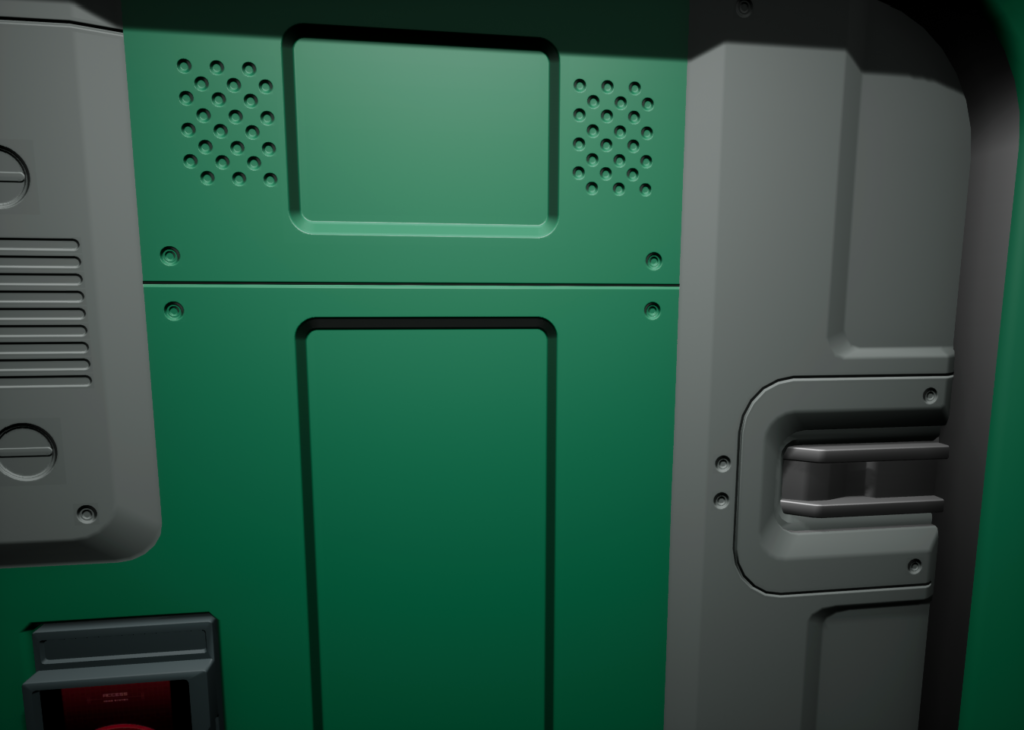
The same yellow shape we have above is the same shape we have here too:
Here we have a roof crown and it’s actually made from several smaller shapes.
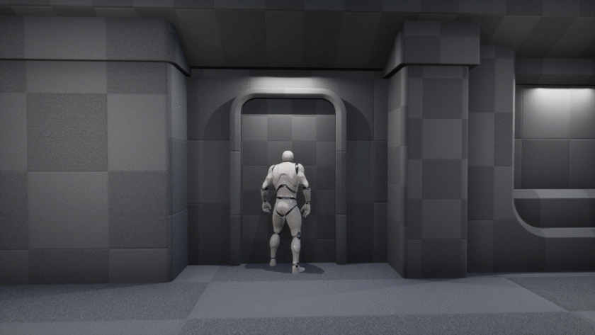
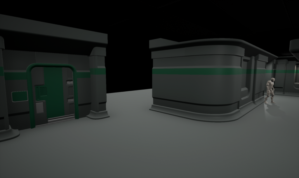
I managed to capture some characters too:
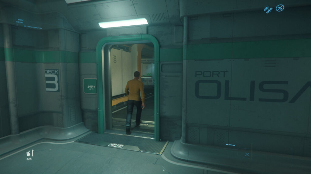
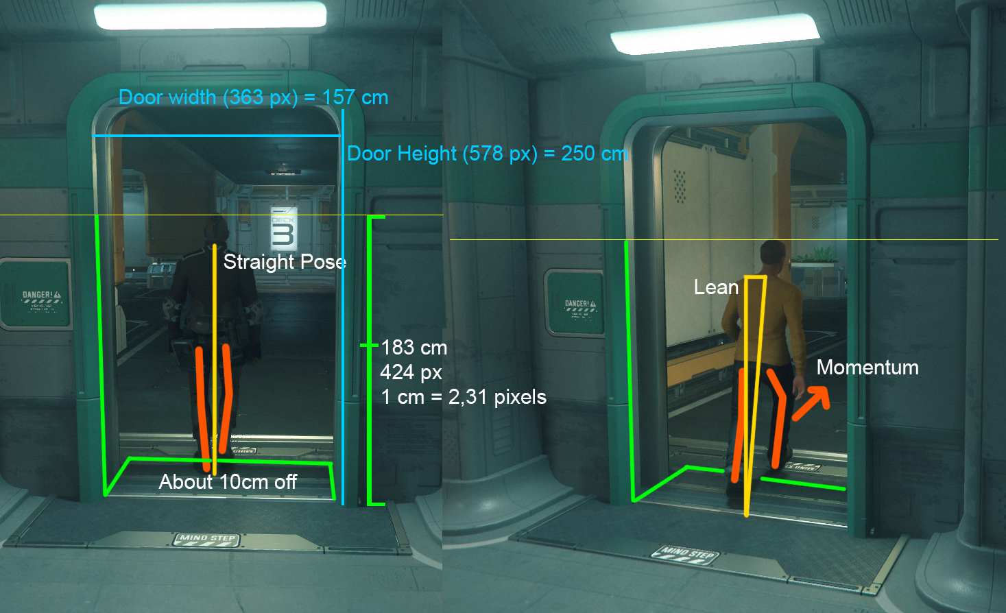
Perfect shot, this guy is right inside a door frame.
I would say he’s about 170-180 cm tall.
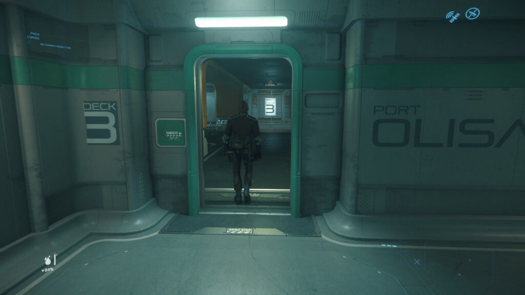
And here we have some actual scales:
The other guy is doing a small lean so hes off about 4 cm. But the guy on left is standing straight so we can use that. We could do even better if we modeled this scenario just with cubes.
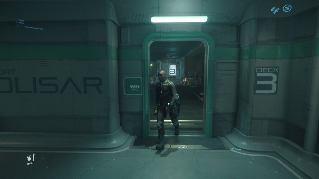
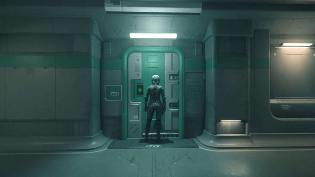
I actually found the real size of characters and it’s 1.83 m. https://imgur.com/d11sdkD
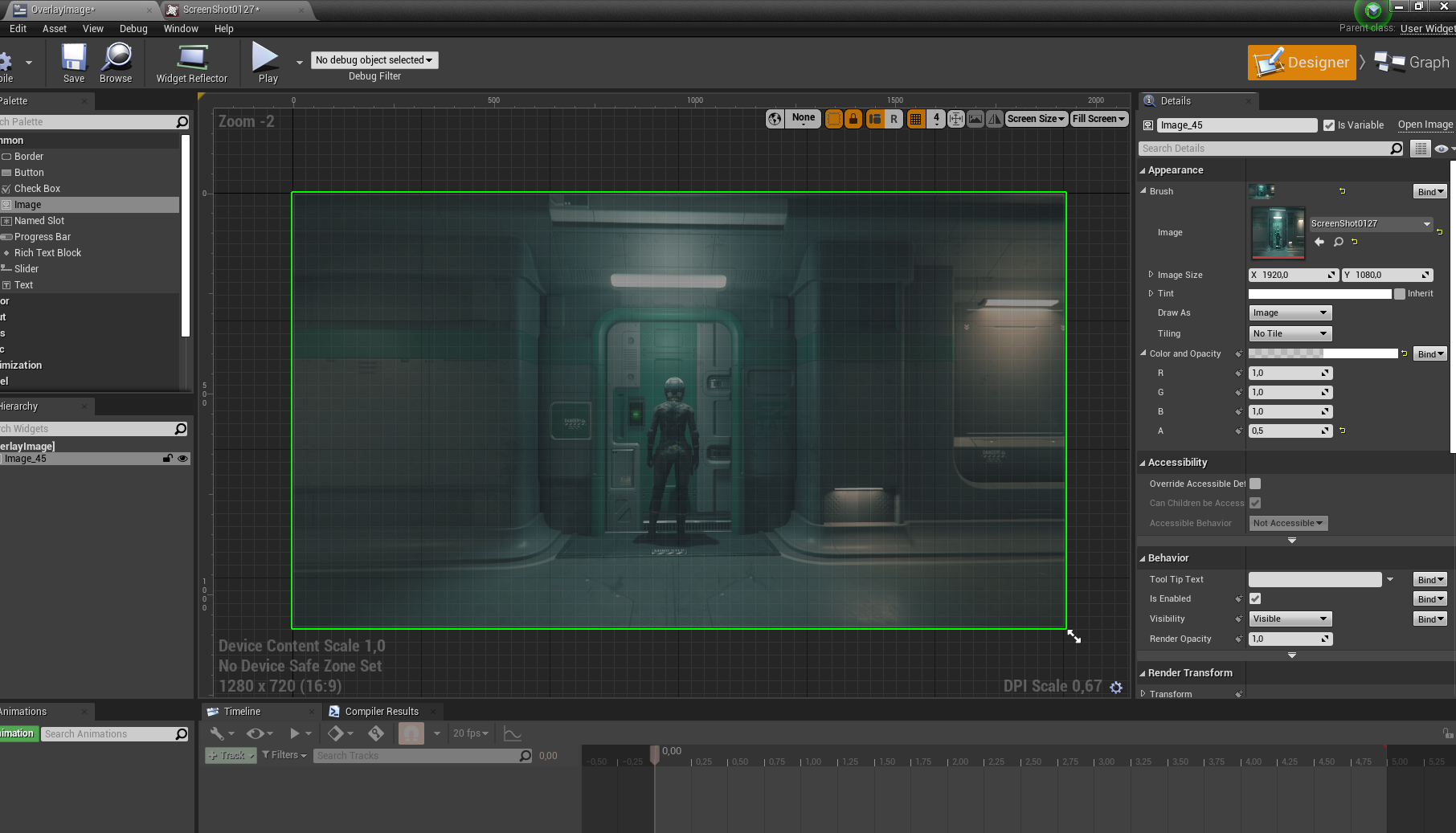
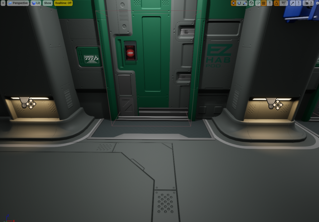
Now we can create a door and use overlay image and where we have this door we can match it to the picture.
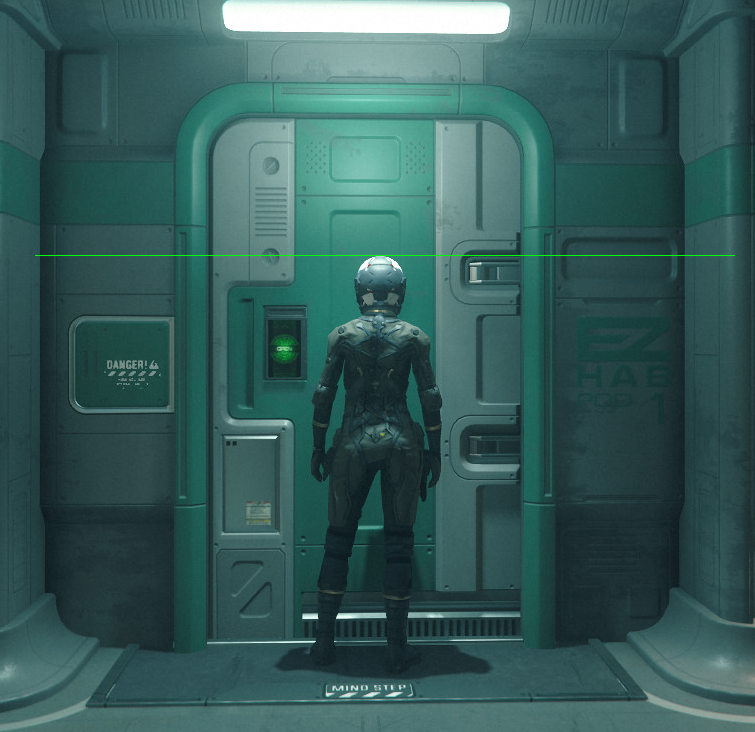
This is the female player character, camera is pointing little bit up so that would make her same size as the dude above, weird huh? All characters in Star Citizen are same height.
Blockout
Blockout or whiteboxes are primary shapes, this is where everything begins and it doesn’t matter if they are clean or dirty. They just need to be fast and in correct sizes.
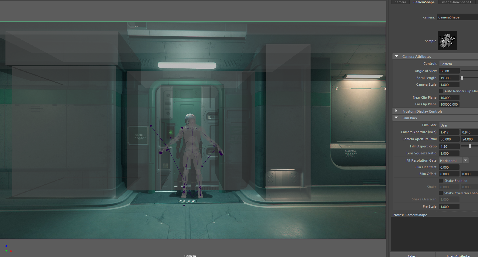
First thing i did i opened Blender and set screenshot from Star Citizen as overlay image in Camera. Also i imported UE4 Mannequin and aligned it with the character from screenshot. Then i created the door with the sizes calculated above and aligned the camera. It came pretty close.
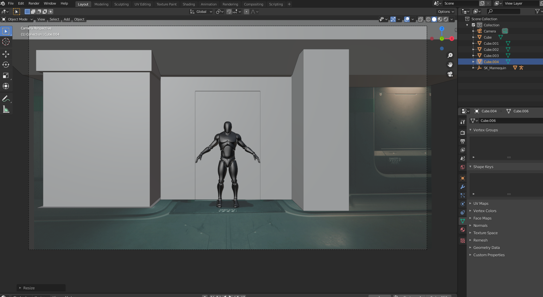
And once i had basic cubes that matched with the door and pillars i moved to Maya.
1 hour later.
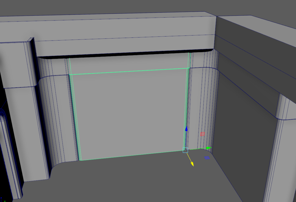
Door corners were created from Torus. Usually i do wide round edges with extrude and then just bevel.
The shape in front of the character looks to have same width as the shape on left.
So i’ll just do this.
Whole thing combined and imported to UE4.
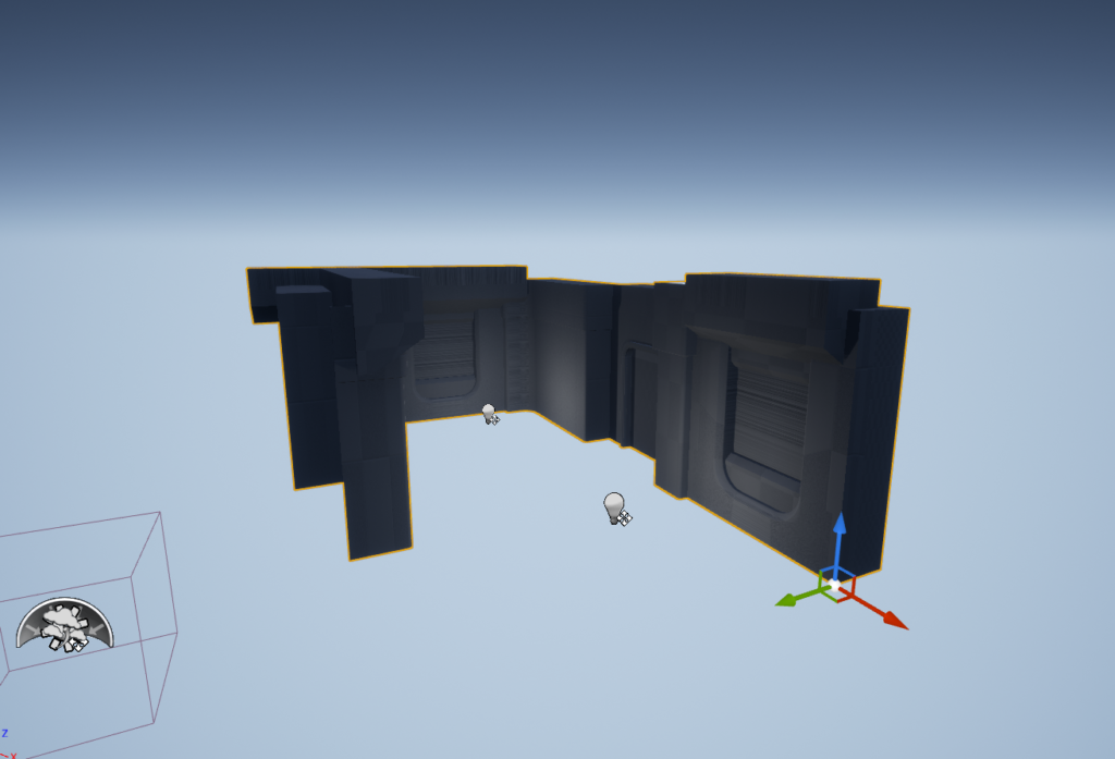
Then i imported modular pieces and set them in their correct places.
Sizes and shapes felt good here. Some things feels off but let’s not go full Doomer.

I’m still missing this bend.
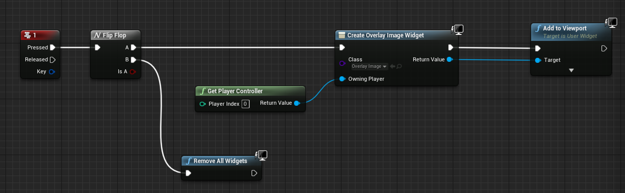
Let’s create a widget so i can set screenshot as overlay image.
Like this.
And in firstpersoncharacter blueprint i just did this.
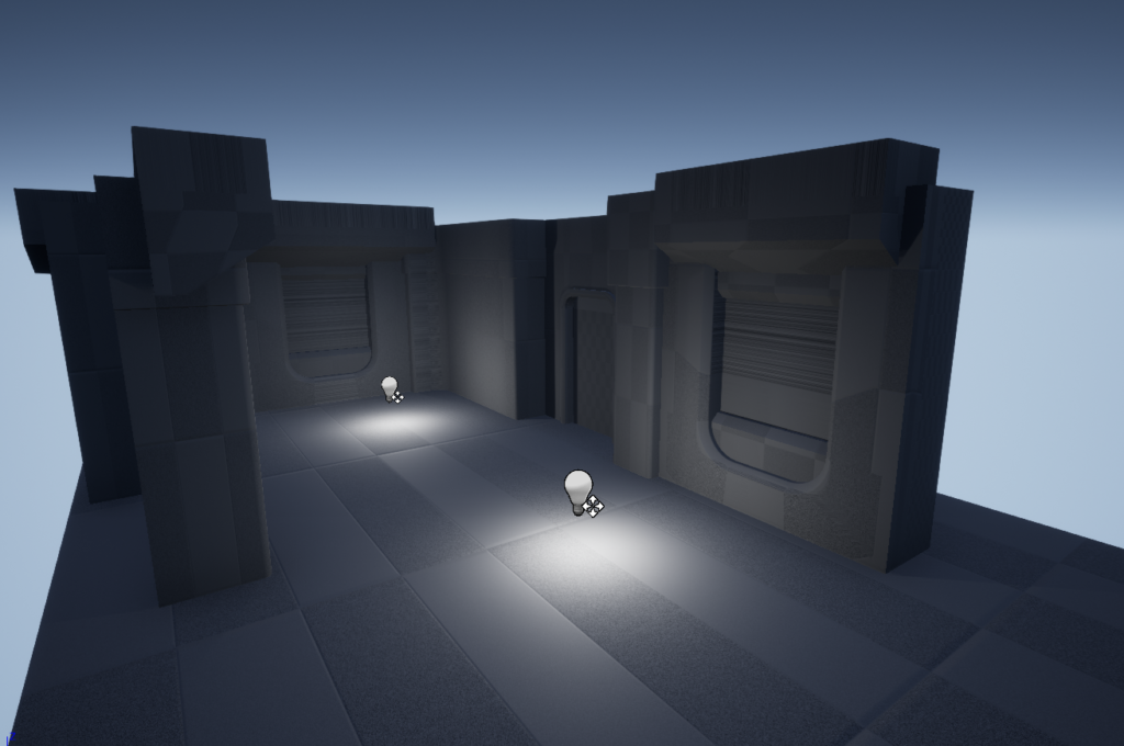
Then i just aligned the doors and this is what i got.
Here are the major problems i see for now
- Roof crown needs to come lower.
- Wall with hole has too large corner bevel.
- Wall hole is deeper into the wall.
- Wall hole bottom needs to be higher.
- Wall hole edge bevel is too large.
- Wall hole bottom prop inside the hole -> lower edge needs to be 2 cm higher.
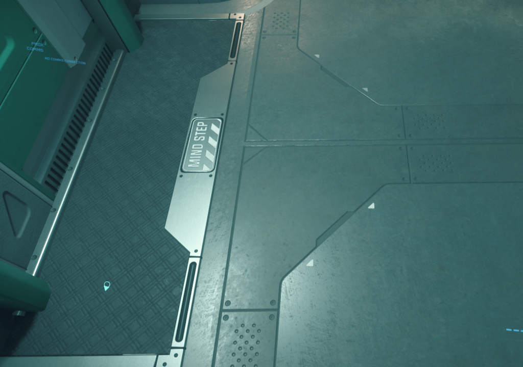
So far I’ve been using 10cm snapping but it looks like some pieces are not modular in Star Citizen screenshot. Also the fov in Thirdperson (Star Citizen) is different then in firstperson.
This is from firstperson and i backed so much that the character touches wall and it can’t move back anymore.
And this is Thirdperson camera. I think it was touching wall too.
Really annoying to notice these things when you’ve put some time in your work!
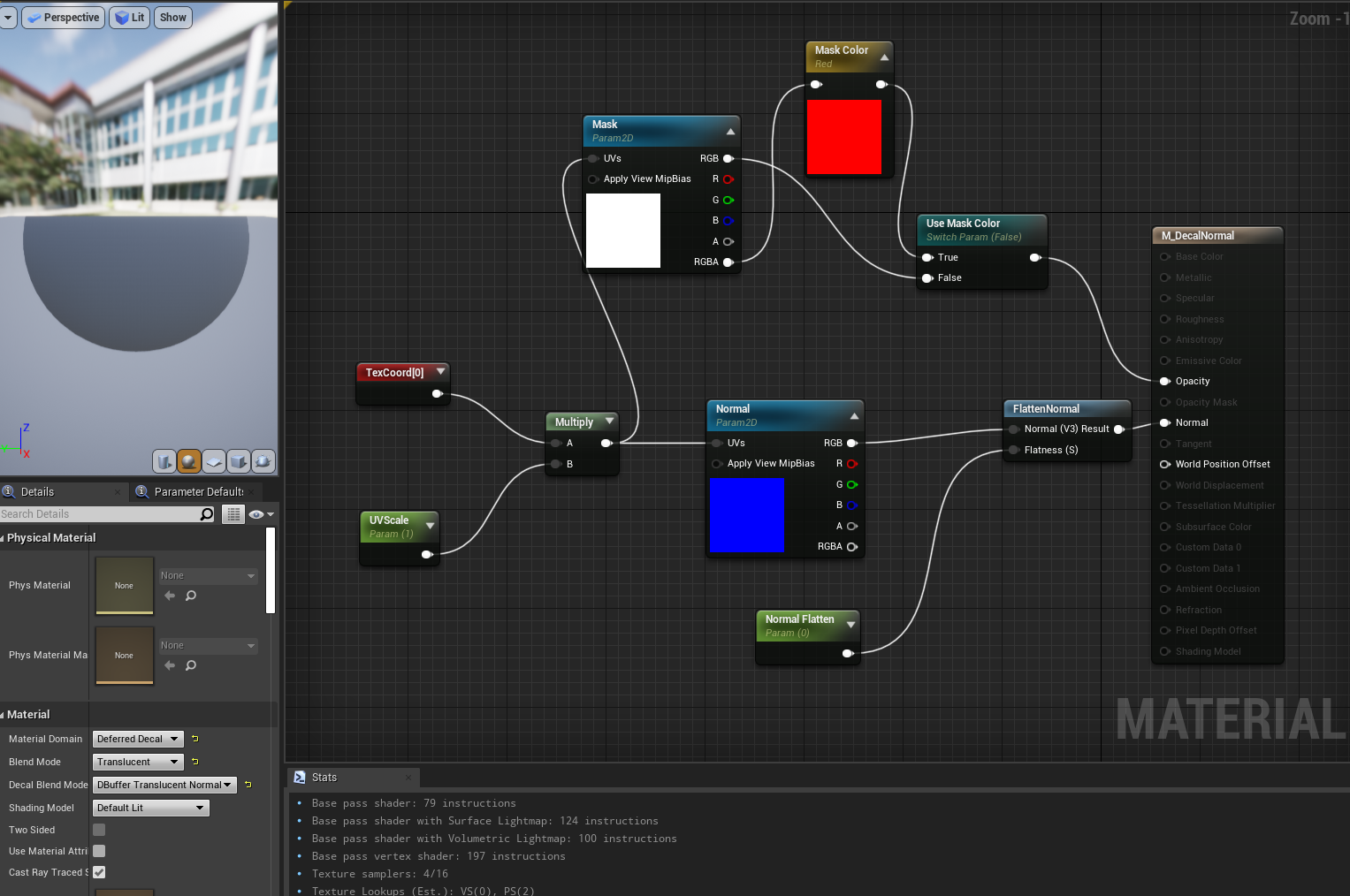
It’s time to advance. I made a postprocess material.

And assigned it into post process.
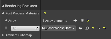
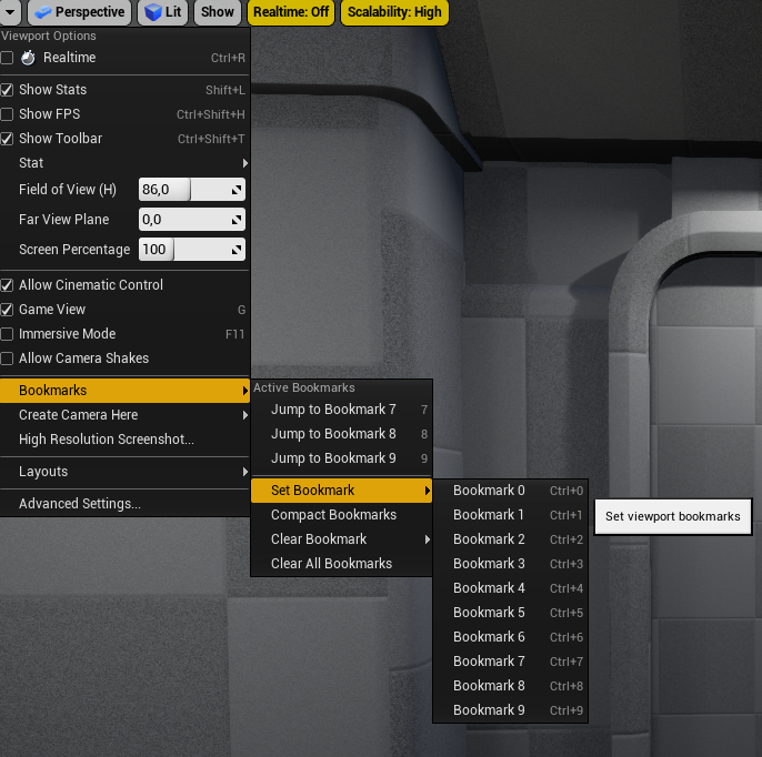
Now i don’t need to press Play and i can just hover around in editor, find a place and set bookmark. And then i can control overlay strength from material instance. This is much faster then playing with widget overlay image.
Another place.
- Pillar interior cut is thicker.
- Door frame is too deep.
- Roof crown bottom is too deep.
- Roof crown top is 5 cm too deep.
- Depth cut angle in door frame is too low.
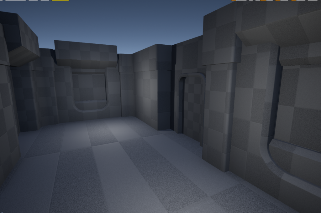
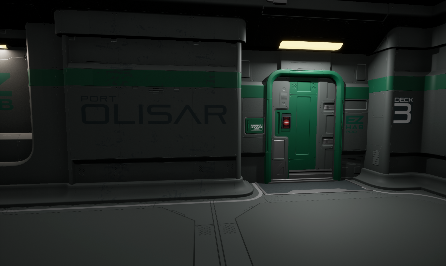
Better matching with closer screenshot:
Matching finished for this one.
That door edge frame is really hard to get right so I’ll just stick with this one. Everything doesn’t need to match 100%, it just needs to feel similar.
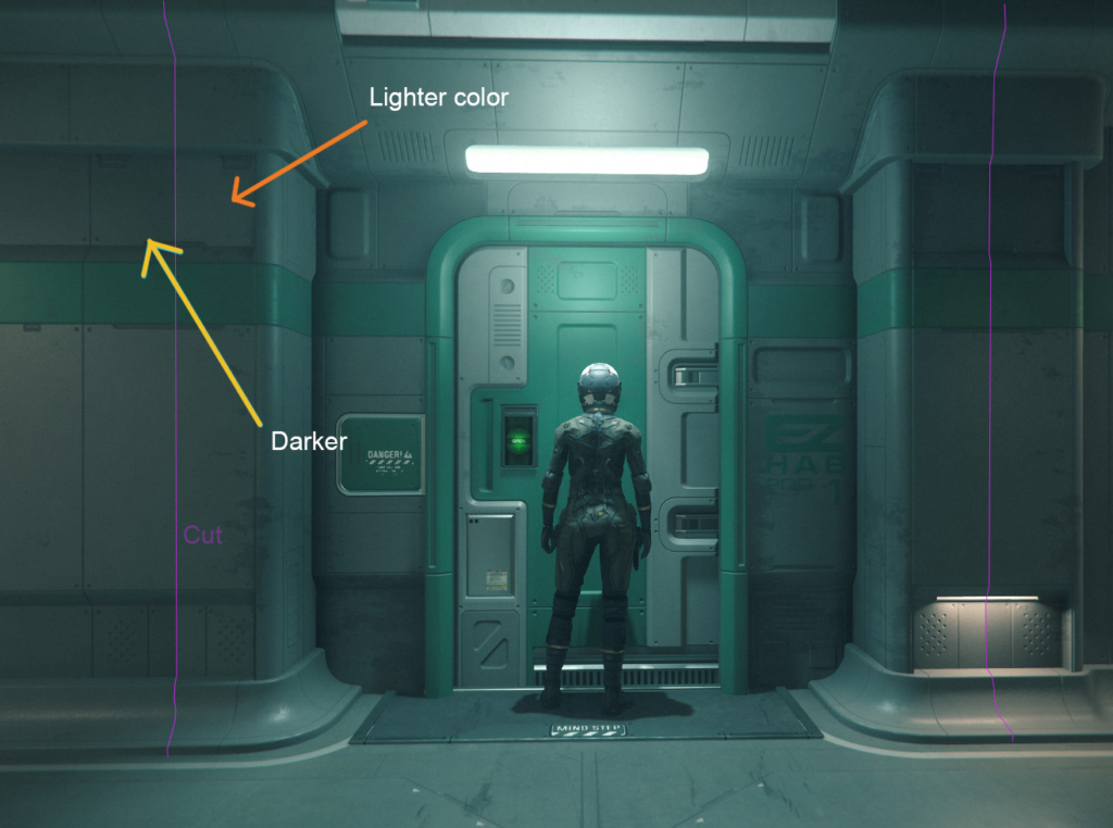
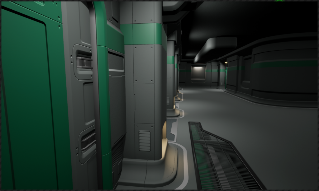
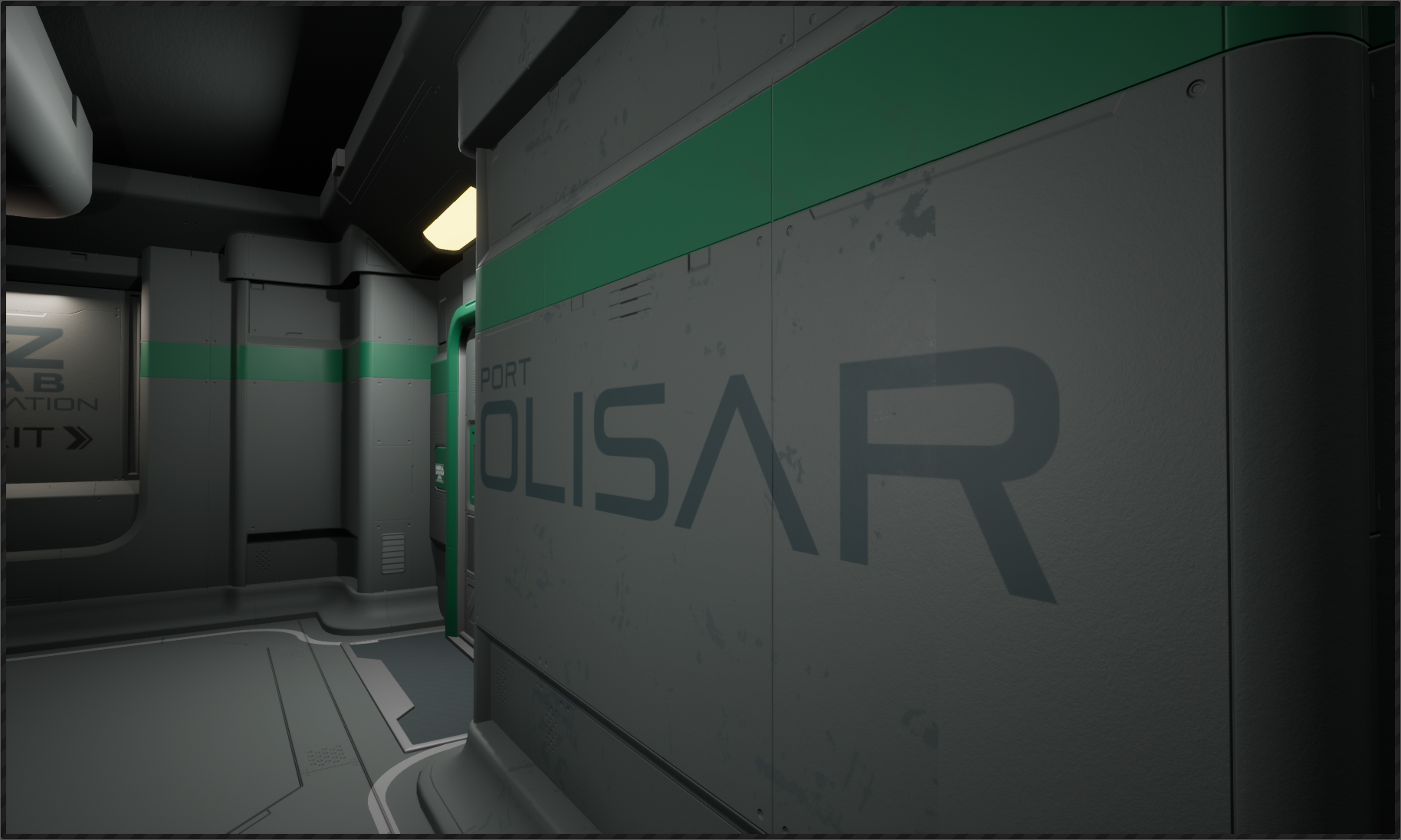
Something what i failed to see at the beginning is that the modular pieces are actually different then in my first review.
If you look at the pillars you can see a noticeable color change, right in the middle.
Here:
This means that the pieces are actually like this:
So basically they are covering the whole wall.
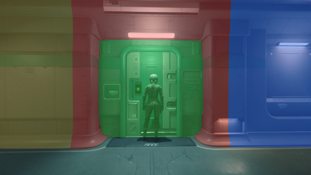
Color change happens because of texturing or UV maps.
I decided to speed up things little bit, so i gave it some colors and secondary shapes for the door.
And for some other pieces too.
After that it was starting to look like something:
So plan for now is that i keep going into middle until i hit those benches and once I’m there i wont use matching I’ll just eyeball whole thing because otherwise I’m going to get stuck in there forever. That matching took too much time. I’m pretty happy with the results so far even though there’s still some problems with the door, I’ll probably just leave it like that OR i could scale it inside UE4 and get over it. Plan for the door touch screen is that I’ll move it into blueprint and put it all together there.
Once i have all wall pieces, benches and soda machine I’ll create collection of all the decals and start creating them. At that point it should get really easy.
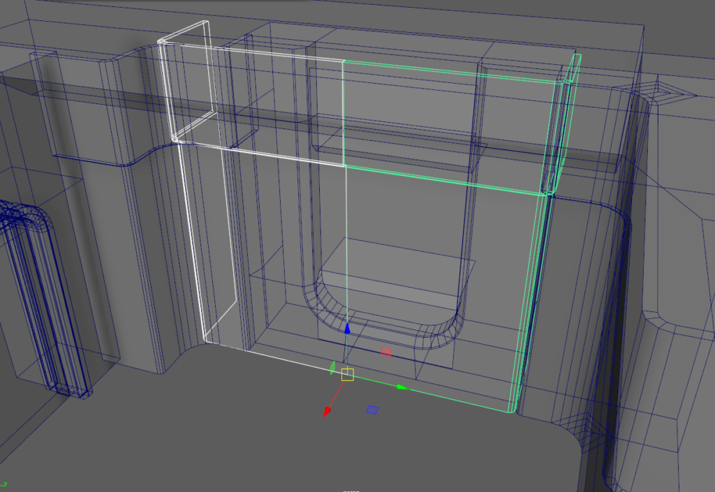
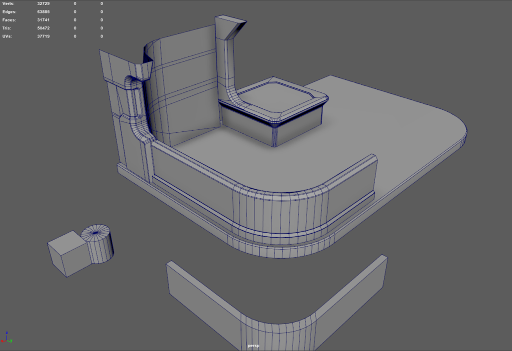
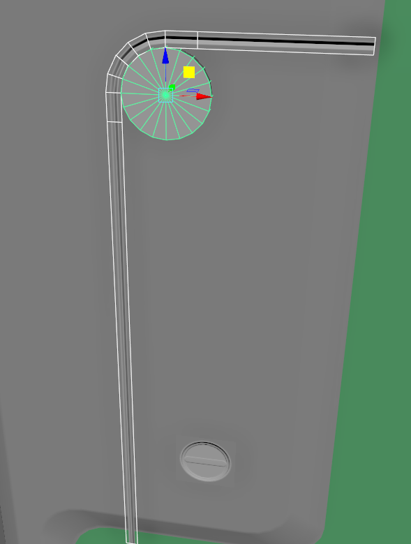
Creating the corner bend with Maya’s Nonlinear Bend tool. Deform -> Nonlinear -> Bend
Time to get into benches.

I created these cubes inside Unreal and matched them close as possible to screenshots. Also i noticed some problems, the bend that curves inside which i just created above needs to be little bit more sharper and one of the straight shaped walls was too wide.
I only need to create half.
Shapes exported to Maya.
Got good start here. First i tried to create that bend wall/fence from cube and then bevel the corner but it didn’t come even from middle, so i just made it from cylinder. Think i’m through hardest part for now.
1 hour later, more stuff.
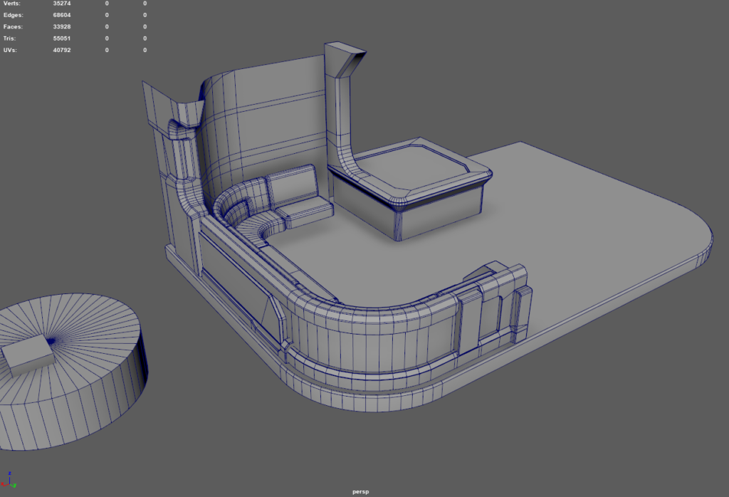
Next Day
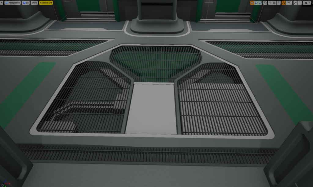
On a second day i decided to go for the floor in front of this thing.
In Unreal.
And in level.
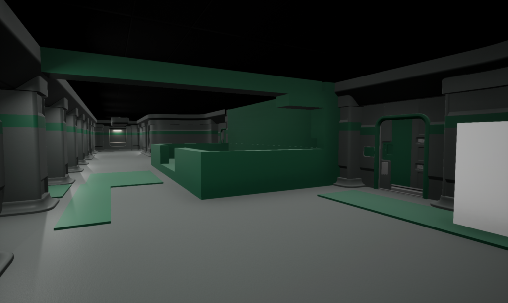
More stuff on bench thing and the round things around it.
Roof peaces, still missing a lot. This part was painful and took a long time.
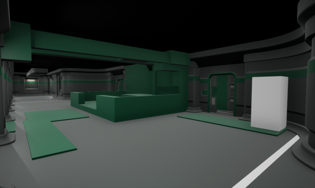
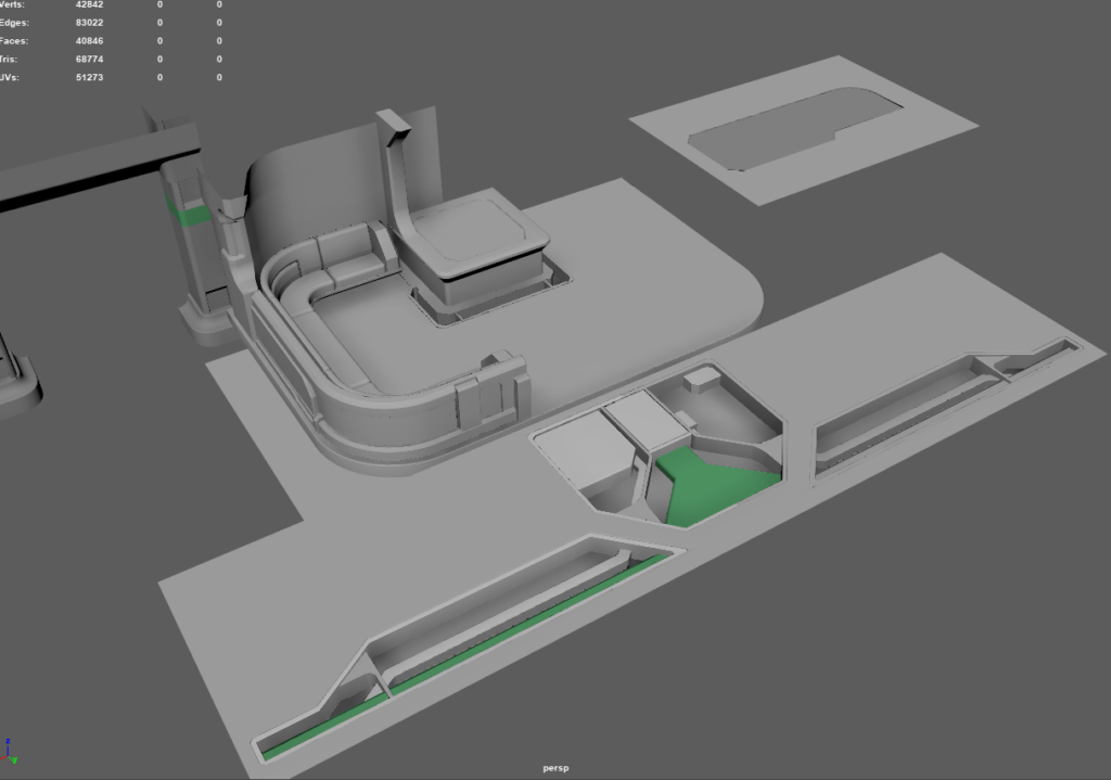
Dublicated side, i decided to take a look at it in Unreal.
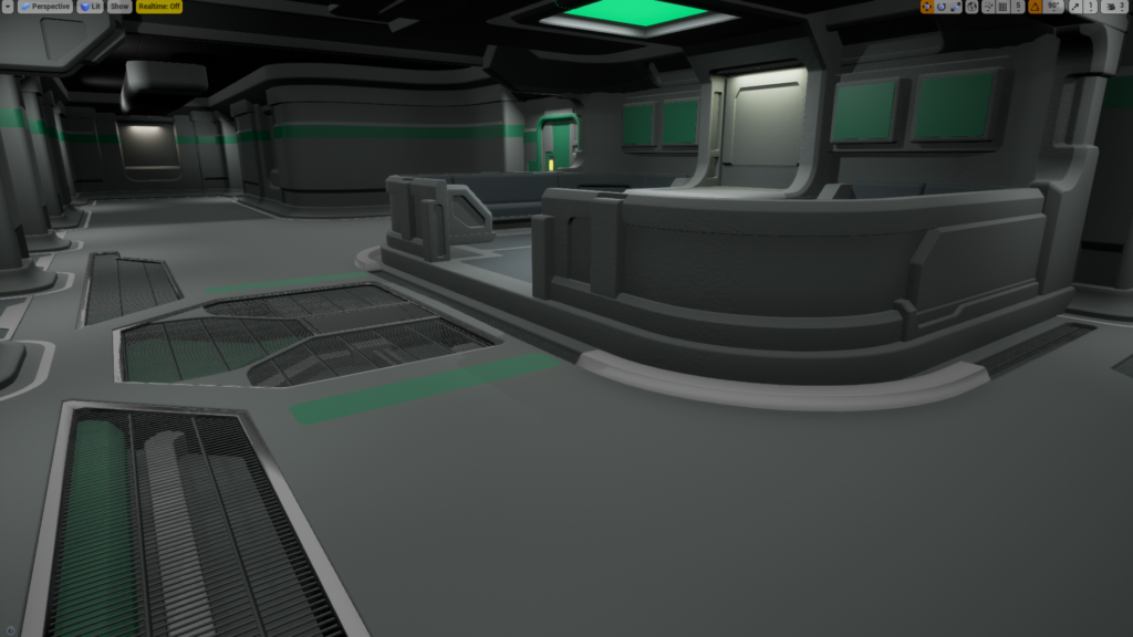
Let’s look at the reference.
And here’s my peace. There’s some small problems but it’s really close. Of course materials are all wrong and there’s this blue light/glow everywhere and smoke/dust.
Another reference.
This looks really good too, only thing i see is that piece on top left is in wrong place.
And on that day i spent over 6 hours on that.
Next Day
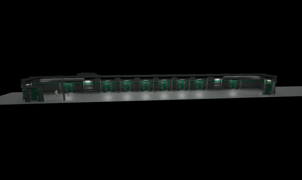
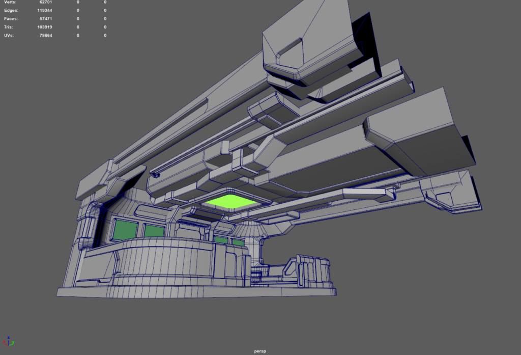
Finished.
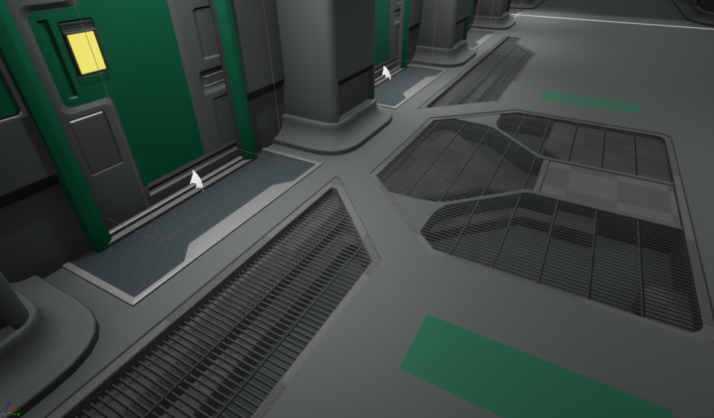
Let’s get into decals. Usually i do this kind of setup. Grouping shapes into normal only and decals that have color or dirt into their own. It’s better to do Stickers in Photoshop.
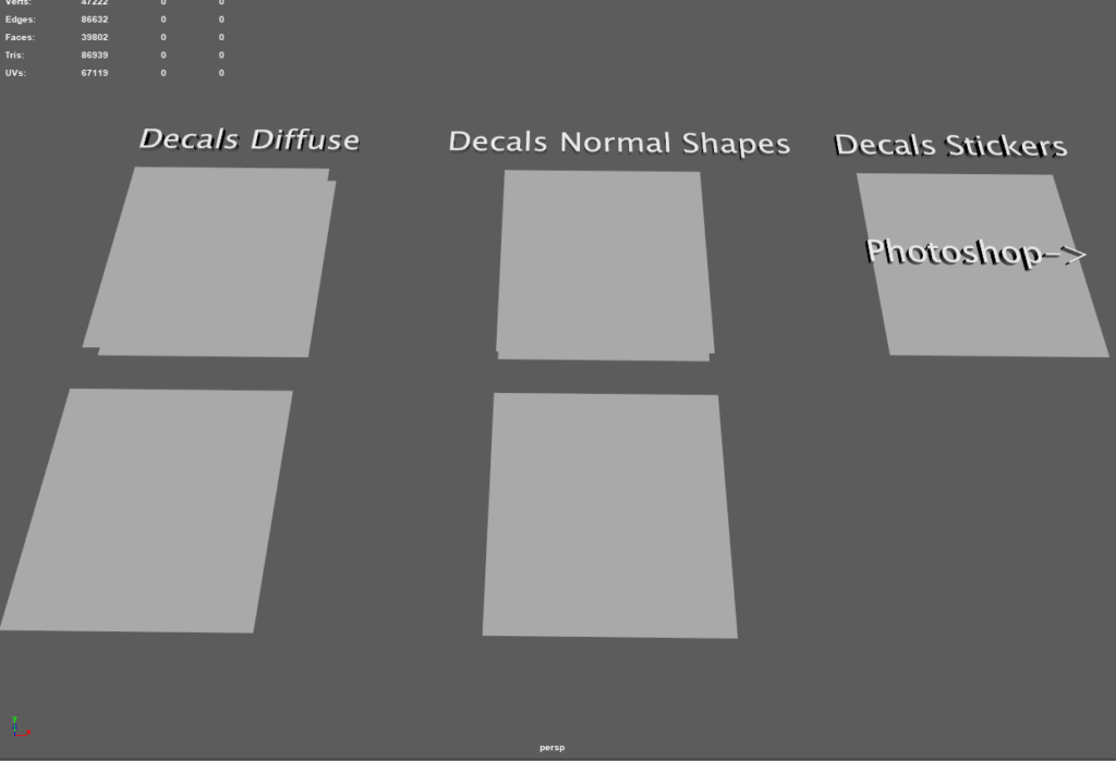
Hipoly meshes.
And after baking i have Material plane, then i duplicated that and separated shapes.
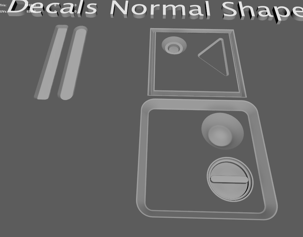
Using cylinder shape to create rounded corner. This is from cube shape panel edge, i just removed left top corner and used left and top straight parts.
The translucent map XNormal created had some problems.
So i just baked Vertex colors and used that, xnormal even created alpha channel for that map.
And here’s the end result.
My material instance settings, as you can see there’s not much going on. Flatten normal helps to boost normal intensity.
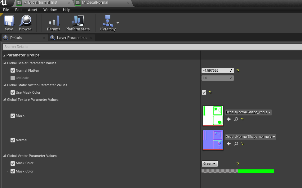
Sometimes normal decals don’t render from far but this came out really good. Sometimes they even completely disappear from angled view. This is why mesh decals needs to be kept as their own object.
Next Day
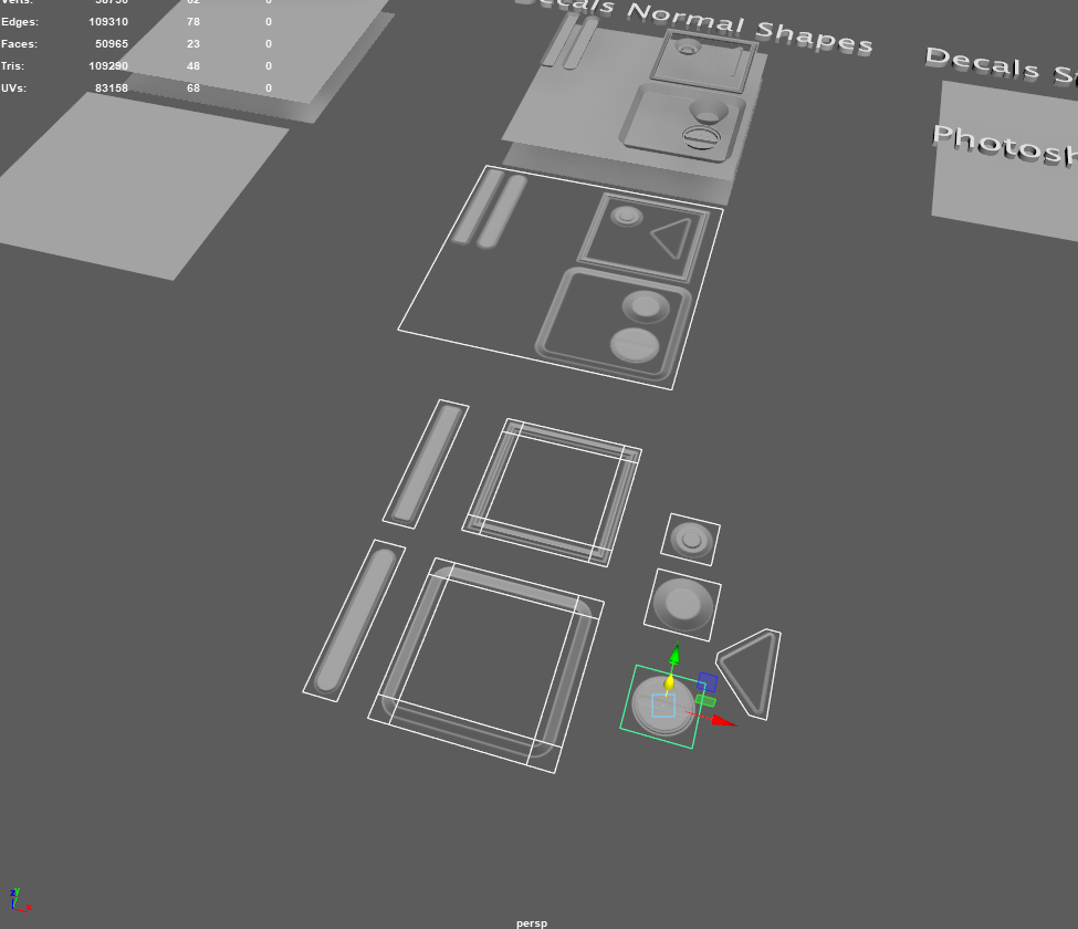
2 hours later I’ve got more decals. I’m still missing stickers. There should be EZ HAB POD (Number) and danger stickers right here. Oh, and i couldn’t make sense of 2 normal shapes so I’m missing those too.
And that was it for that day. Decided to end it early and do something else because it was Friday.
Weekend
I finished decals for 3 wall assets and started doing text stickers.
First i had to find out the fonts. I used Pirulen and Roboto.
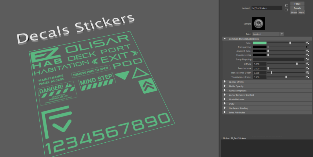
Then i just cut them out in Maya and exported all of the pieces into Unreal.
Tried a little material test here.

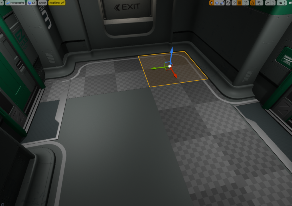
Also i made some floor decals and tileable floor plane.
This is how i figured out the floor plane size, so i just used bunch of bosh brushes and got the size from them, it was 440 cm.
It was a square and after eyeballing the middle color change it was easy to figure out the decal places.
Here you can see a small color change to lighter in the middle panels.
Theres just one problem…
This is where the decals should be. So it’s off by 20 cm.
It’s kinda complicated to fix because it’s affecting multiple assets.
The floor decal is matching with the first pod.
180 degrees.
The center of decal edges are under R letter, exactly in the middle. Where in my version lines are at the beginning of R letter, also my OLISAR text is smaller.
So i fixed that by creating another version of the floor panel, size for that floor panel became 440 x 420.
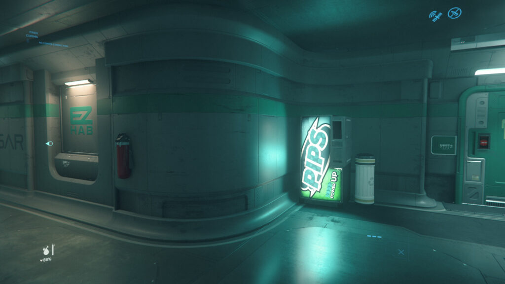
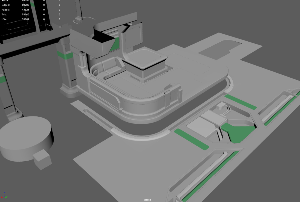
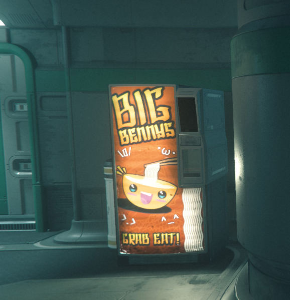
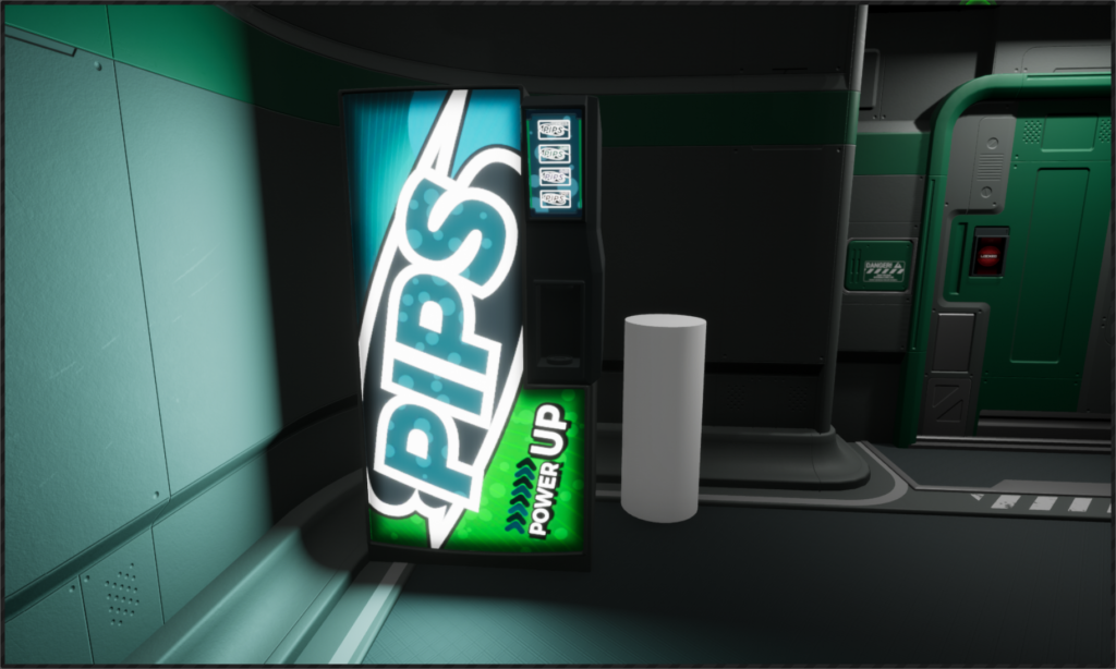
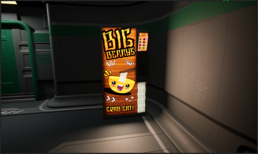
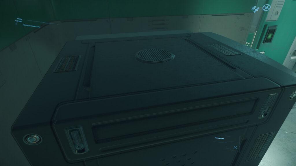
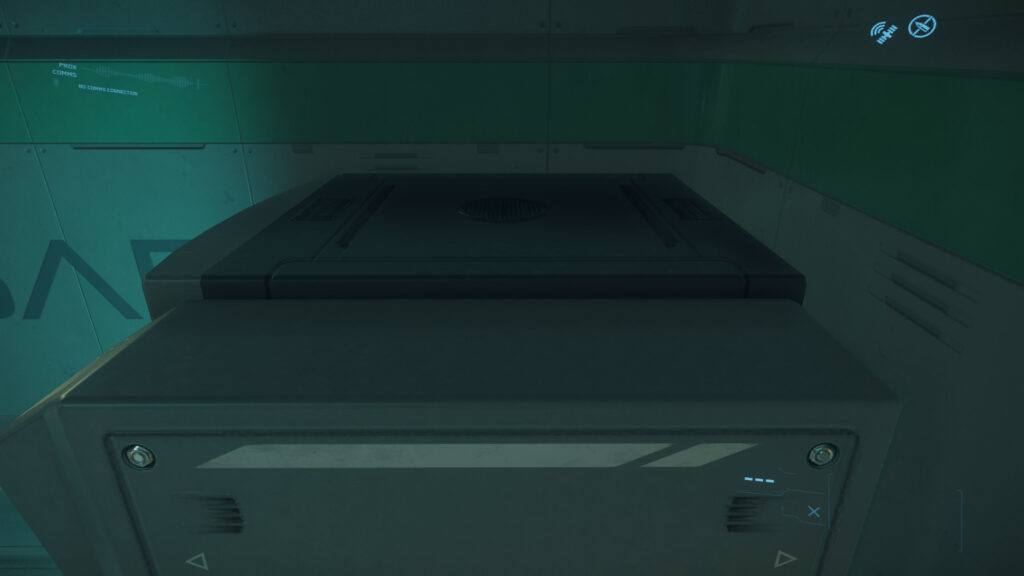
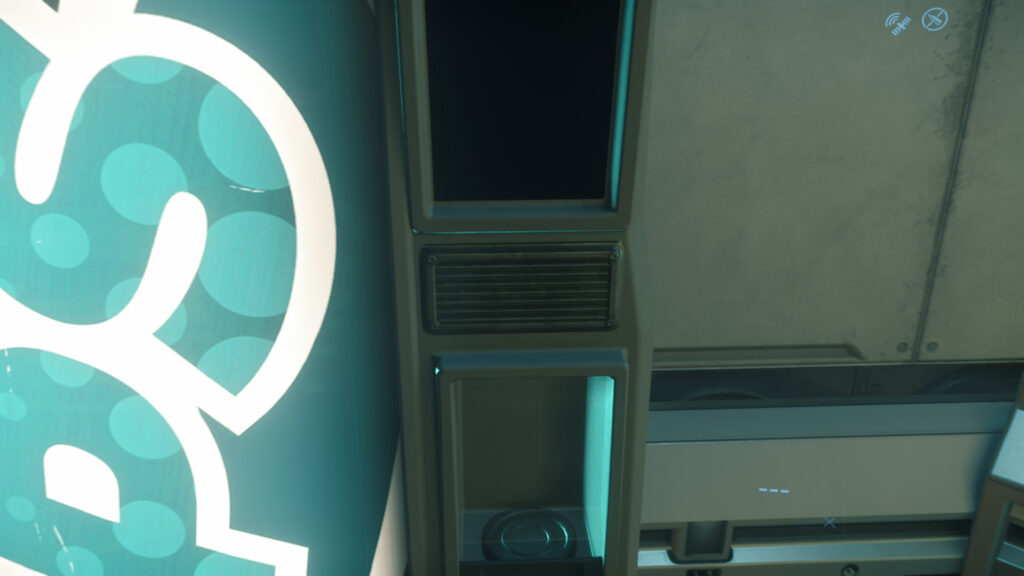
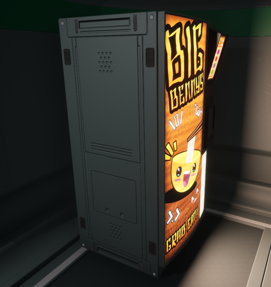
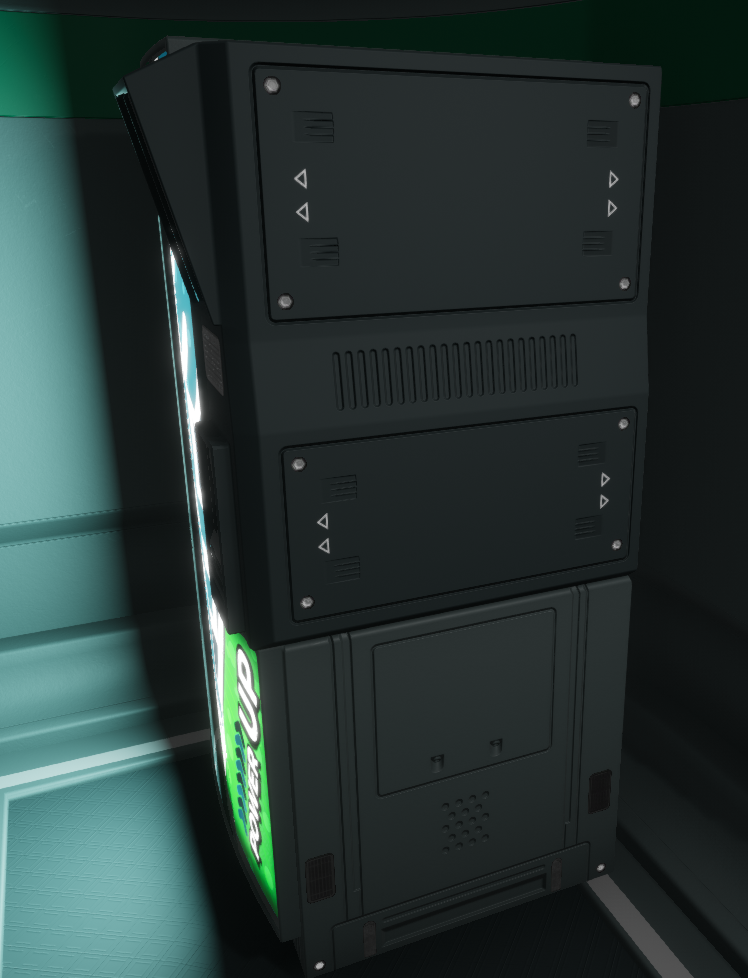
Vending Machine
After finishing decals for wall assets i decided to get into vending machines.
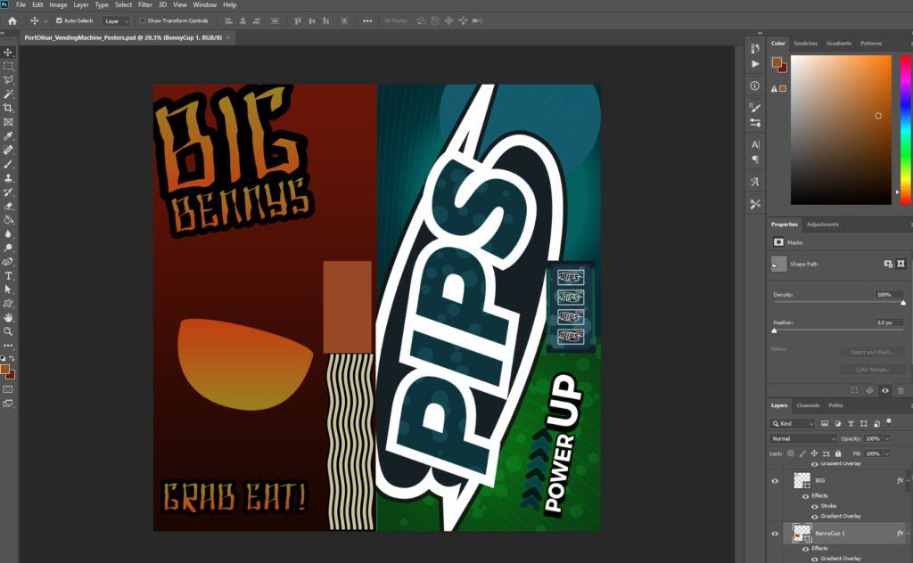
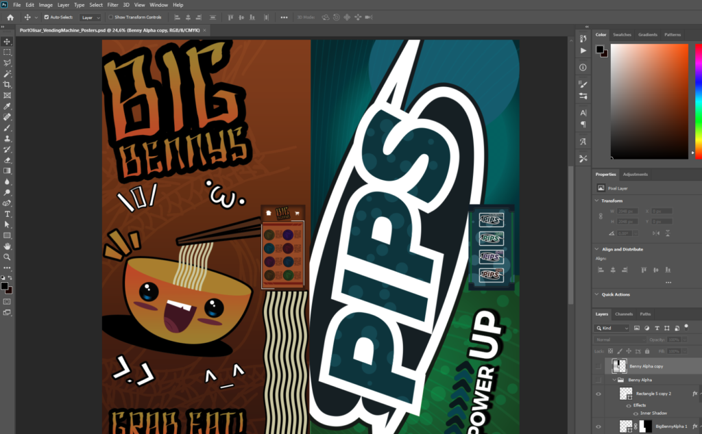
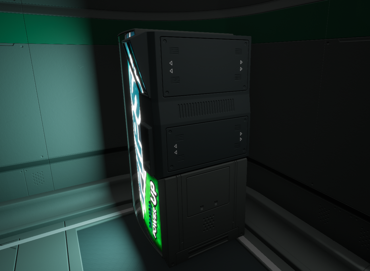
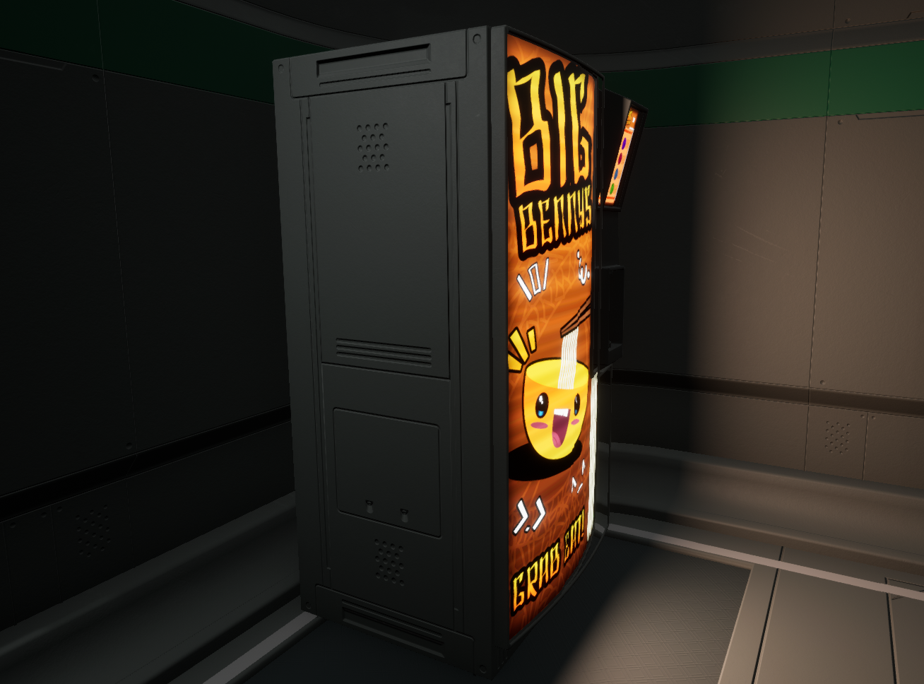
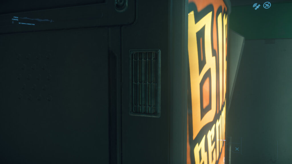
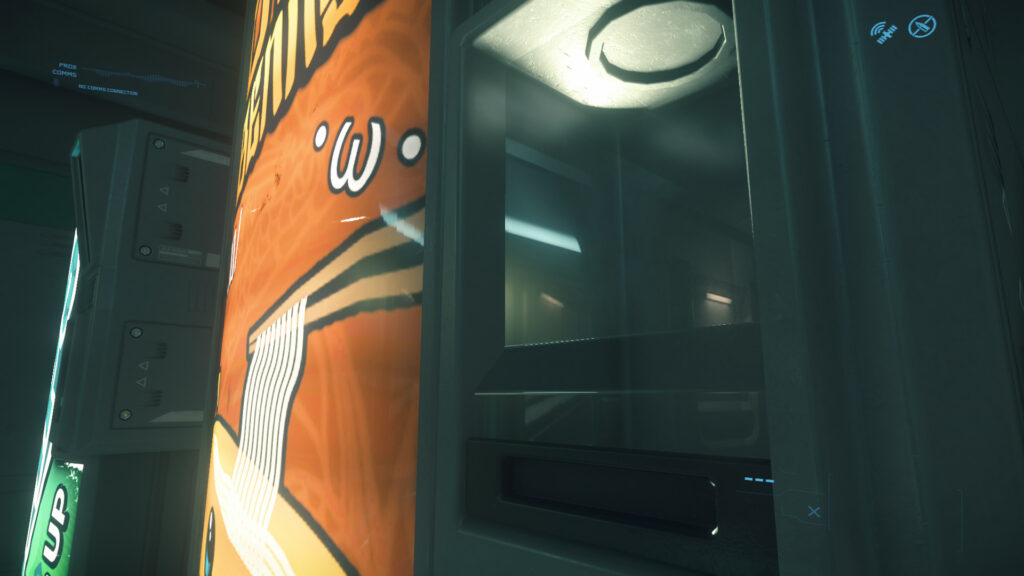
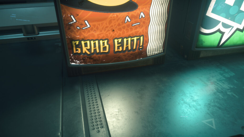
This vending machine has two posters one is Big Benny and other one is PIPS.
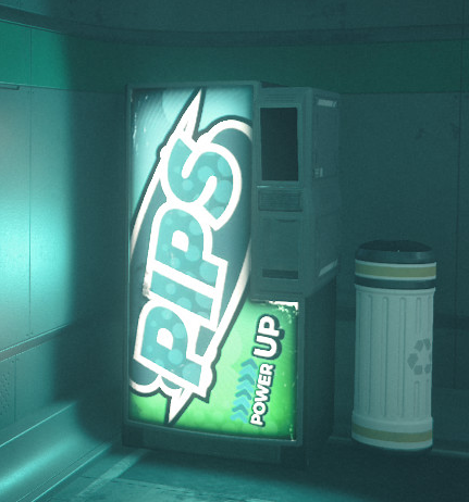
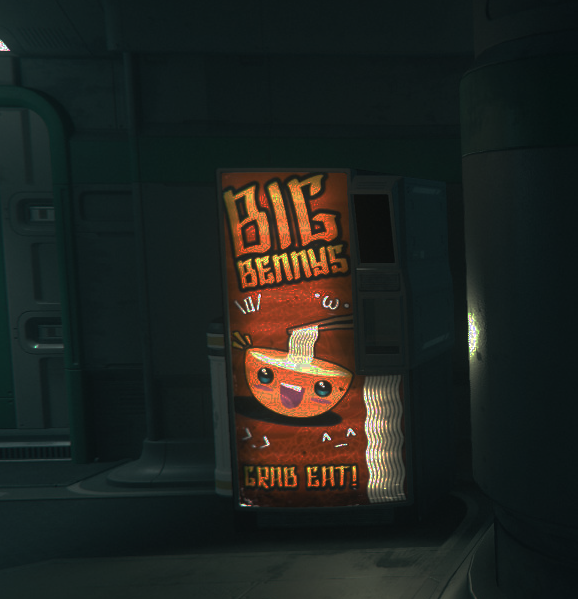
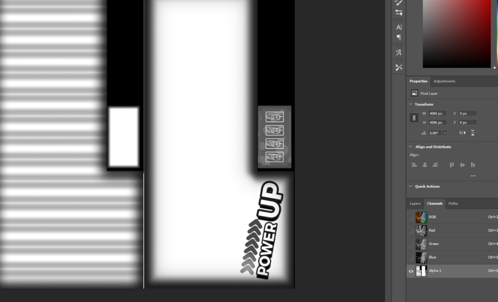
I took this shot in Photoshop and decreased the brightness. As you can see it reveals that the original colors are really dark and then there’s this emissive trick, horizontal lines which creates dark lines. Vending machine posters are lit by light tubes. The corners also have dark effect.
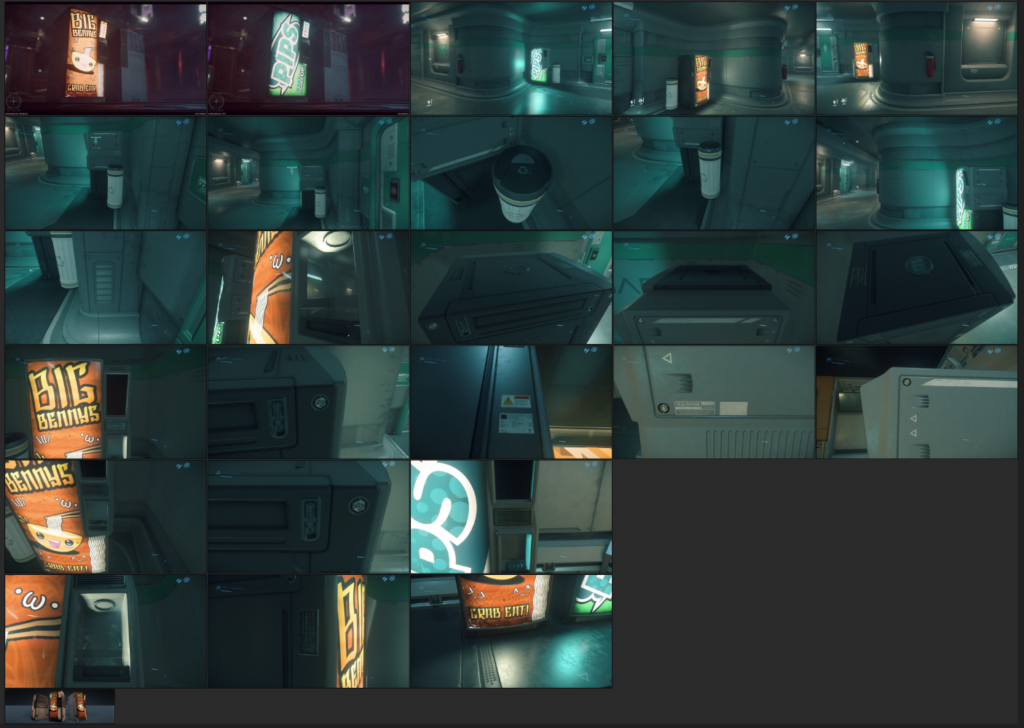
All my references.
After modelling the vending machine in Maya i moved to Photoshop. Fonts were easy to figure out with curves over the screenshots, then using Fontsquirrels font identifier. Big PIPS font is EquipExtend, POWER UP is Trueno, BIG BENNY text is SH Shai Fontai.
Finale.
Emissive effects was put into Alpha channel.
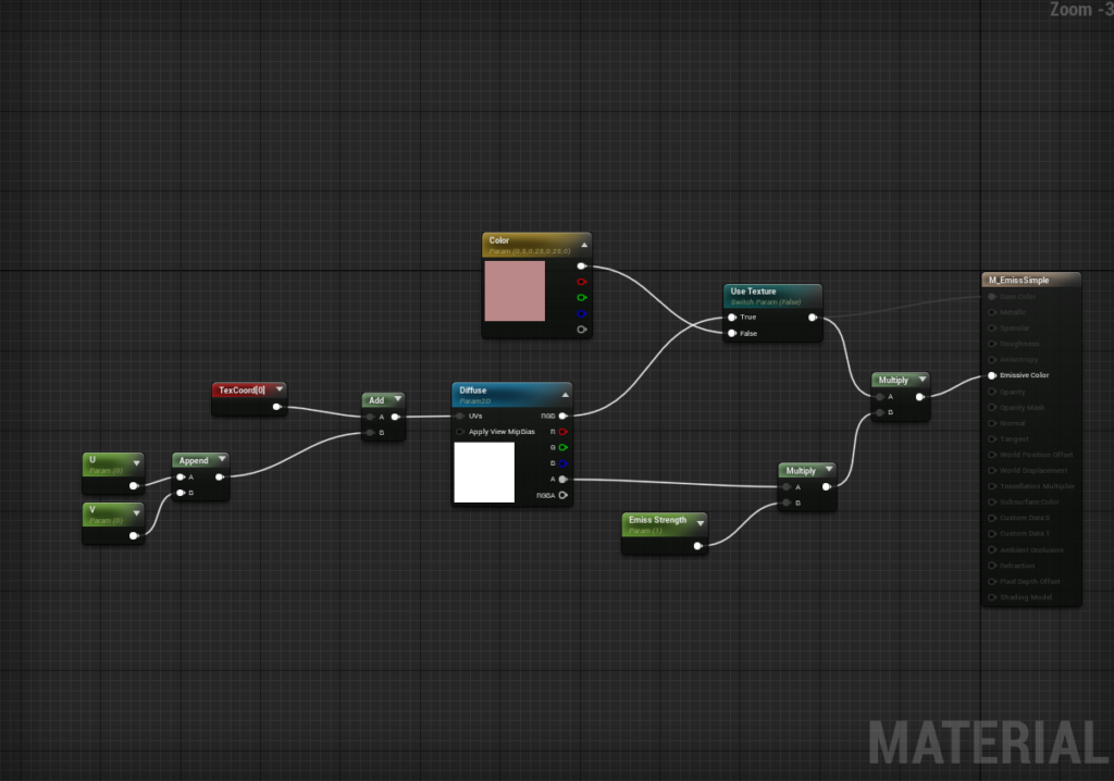
Shader in UE4.
How the posters look in Unreal.
Then it was time to do the decals.
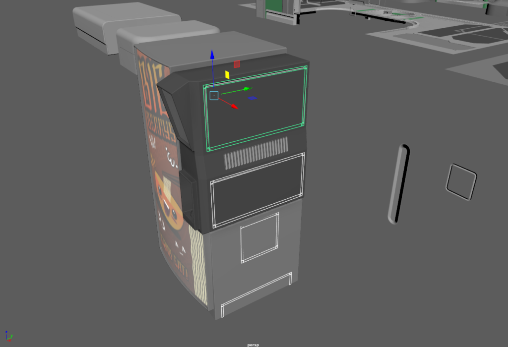
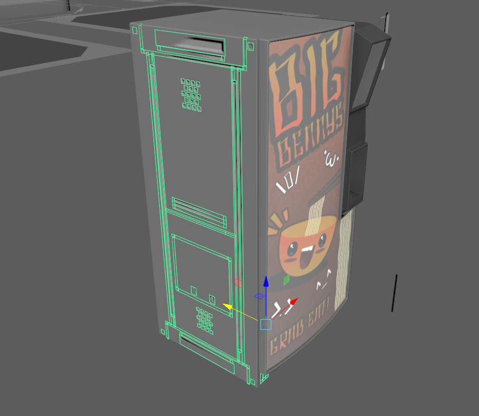
I had to create some new shapes and update normal shape decal textures. I still need diffuse decals (color and normal), some stripes and more warning stickers.
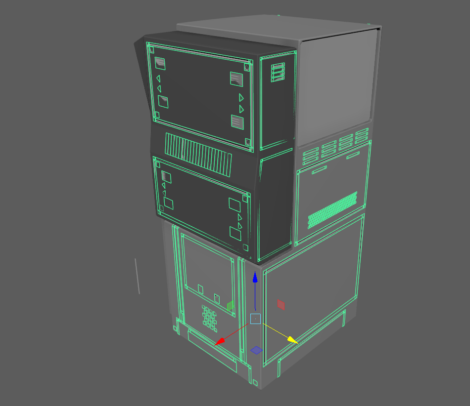
So far it looks like this.
That’s into 20 hours of work, posters took 3 days. Whole project has taken so far 82 hours.
Let’s look at the missing stuff.
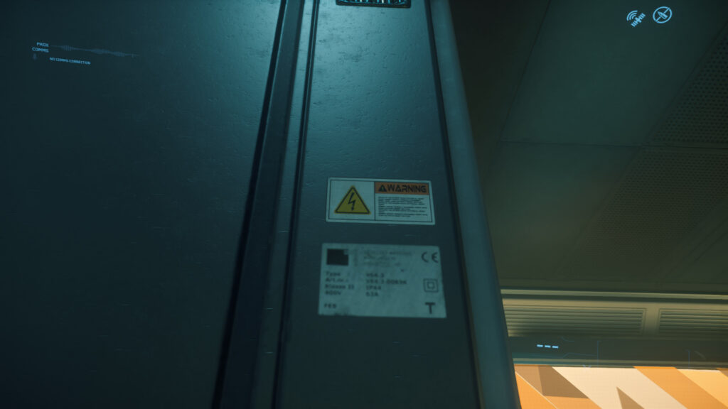
Warning sticker and CE sticker. Think i’ll just take a picture from my fridge, there should at least one of these.
Rounded air ventilation hole.
Stripes.
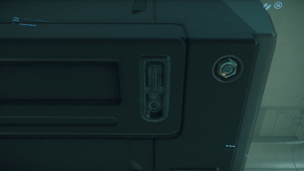
Hex Nut and some kind of locking thingy usually found from suitcases
Another ventilation grill, red wires inside or something.
Another warning sticker and a white square which has normal map or black edges.
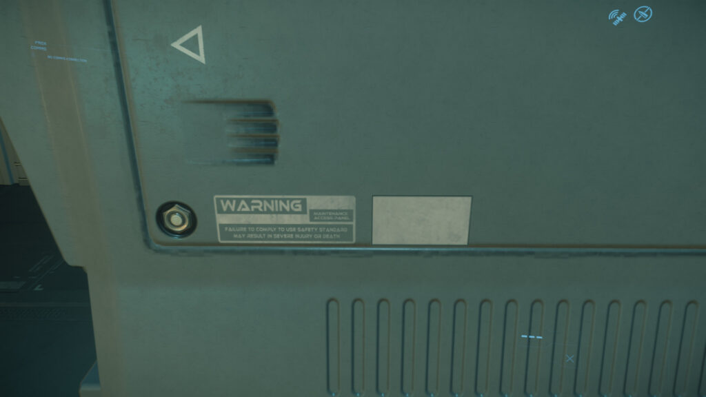
Third kind of ventilation grill.
Lifting cover from glass and it has a handle.
This has to be the same ventilation grill from above …it’s just stretched.
So that makes 12 more things to do and it’s finished, oh wait… and materials.
Color Decals Material
Quick look of the Decal Diffuse textures, this was created in Photoshop.
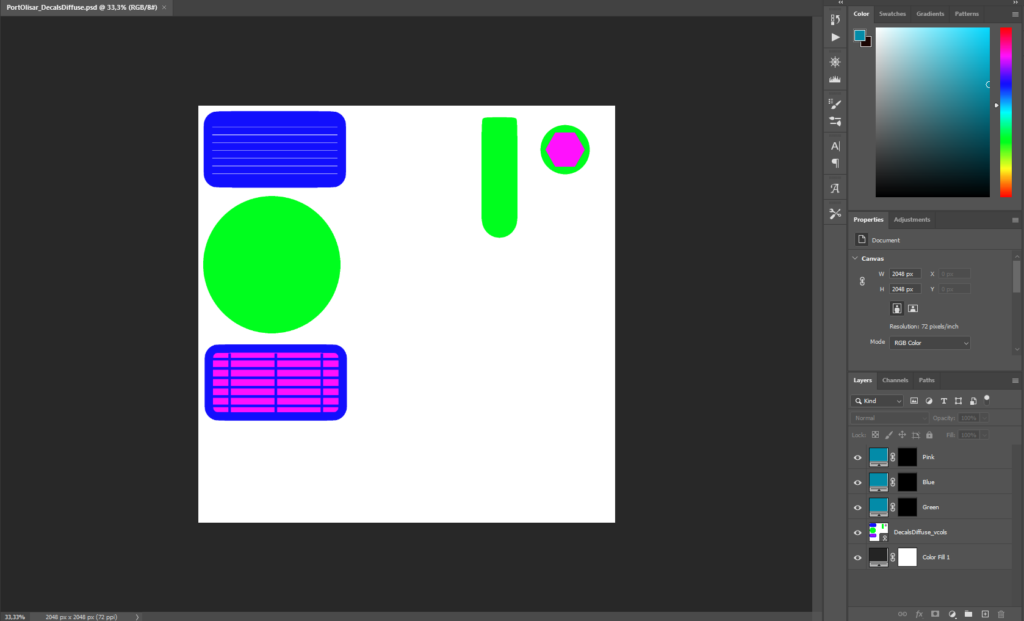
Solid colors and masks.
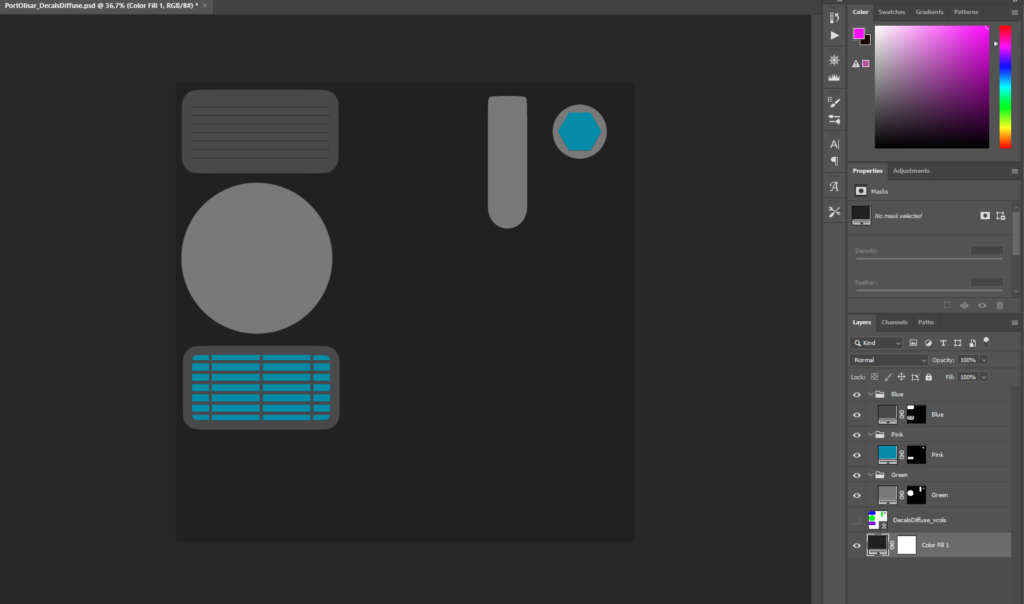
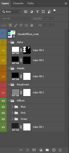
All textures for this material are in same Photoshop file and then folders are just exported.
Like this:
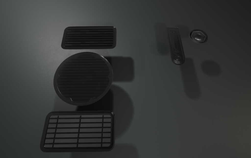
Final result.
Summary
Even though this environment isn’t so complicated it took 90 hours to build, some of it went into the writing too. Especially Gif’s would have taken enormous amount of time if i kept making them for every time i made changes to modular pieces so that’s why i quit making them. I tried to find a middle place where this would make sense for beginners and more advanced once too. So if you feel like i jumped somewhere just mail me.
This environment is just simple geometry but the amount of fine detail is massive (tertiary shapes). Setting those in right places just by comparing screenshots takes a lot of time.
Result for now is really good. Geometry is 98% done, all primary shapes are in place, secondary shapes are done, tertiary shapes are 95% ready. Decal normals could have more depth in them, POM could probably help with that. Materials are really basic and for final thing these need to be created in Substance Designer.
This can have a change to look really impressive and even better then original if it gets good materials. I can’t say much about lighting because it’s all dynamic and dynamic interior lighting in Unreal is all about Skylight and how you set that up, in other words there’s a poor amount of features to deal with this. With static lights this could go beyond original but I’m not really fan of static lights because they make Characters look bad and it’s not a modern solution.
Cya!
[…] Part 2 Here […]